Header
Announcement bar
What is an announcement bar?
An announcement bar refers to a prominent section at the top of a website in the header group where important `announcements, promotions, or notifications are displayed. It’s a narrow horizontal banner that can be customized to convey time-sensitive information, such as special offers, upcoming events, new product launches, or any other important messages that the store owner wants to communicate to visitors. The announcement bar is a way to grab the attention of online shoppers and ensure they are aware of key information or promotions.

How to set up an announcement bar?
- Navigate to the header group within the home page customization section on the left side in theme customization.
- Within the header group, locate the announcement bar section.
- Click on the announcement bar to access customization options, situated on the right side of the screen.
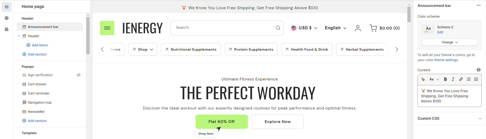
4.Choose the color scheme for your announcement bar from the four available options.
5.To display information in the announcement bar, input content in the provided field.
6.Customize the content further using options such as auto-generating text, making text bold, selecting heading size, italicizing text, adding a link to the content, and incorporating bullet or numbered lists.
7.Optionally, utilize the option to add custom CSS for incorporating unique styles to the section.
Header
What is the header section?
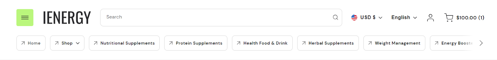
The header section of a theme is a crucial element that serves as the gateway to your online store. It typically appears at the top of each webpage and is the first thing visitors see when they land on your site. This section contains essential navigational elements such as the menu, search bar, and often the logo of your brand, providing users with immediate access to browse through different pages, search for specific products, or return to the homepage.
How do you set up the header section?
- Start by navigating to the header section within the home page settings. You’ll find customization options located on the right side of the screen.
- Within this section, you can expand the width of the header, make it sticky on the scroll, and show a divider line as per your preferences.
- Choose the color scheme for the header from the four available options.
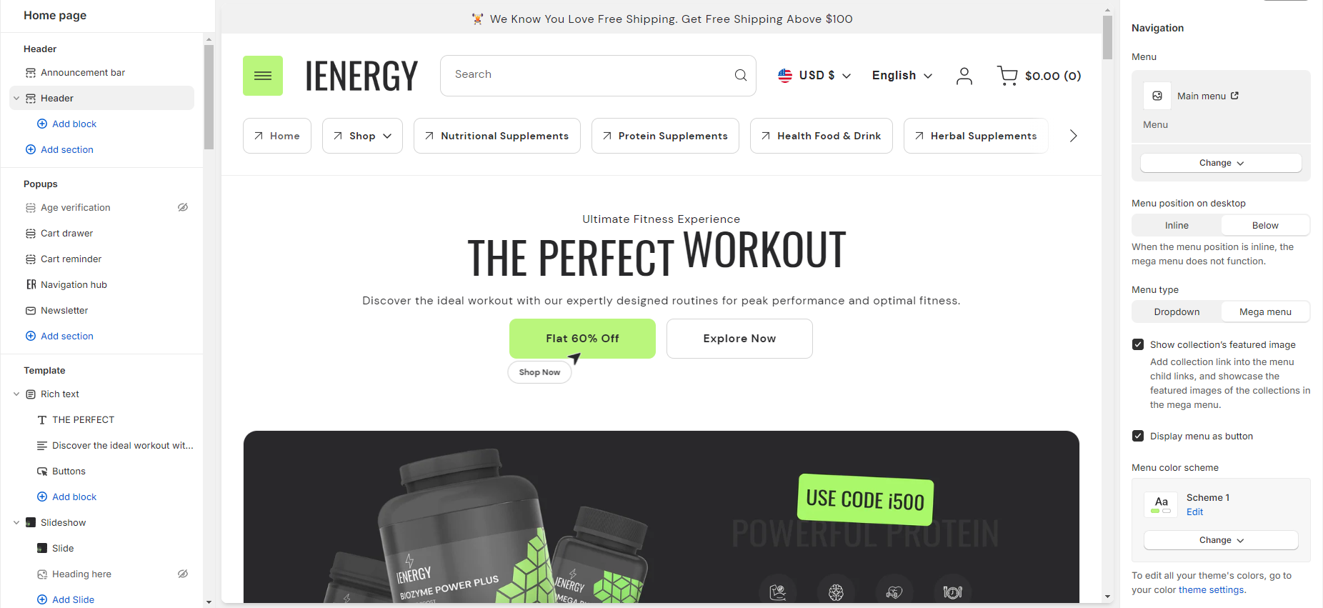
- Next, you can enable the option to show the navigation hub. To edit the navigation hub, navigate to the Popups group and access the navigation hub section for editing.
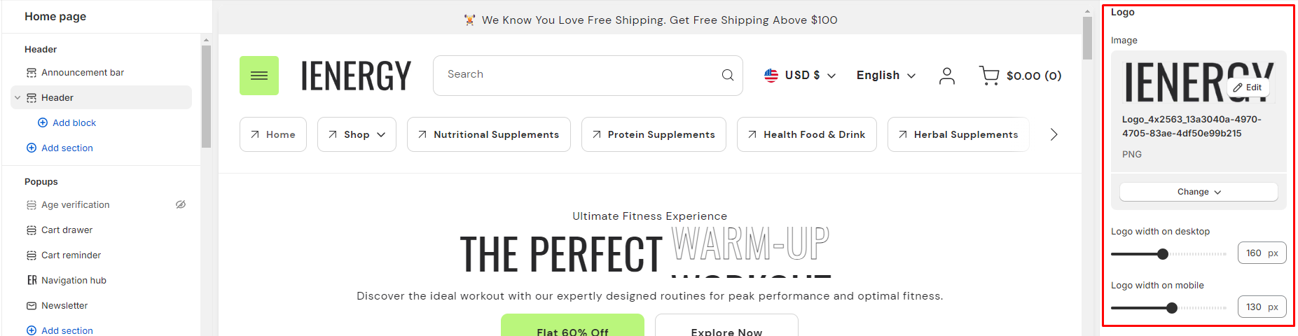
5.Add the logo image and adjust its width for both desktop and mobile views.
6.Select the navigation menu you want to add, manage its position, and choose the menu type from the available options.
7.Enable the option to show the collection’s featured image and choose to display the menu as a button if desired.
8.Customize the menu color scheme from the four available options.
9.Manage the search functionality, such as enabling inline search on the desktop.
10.You also have options related to localization, such as enabling the language selector, country/region selector, showing the country flag, and displaying the country name.
11.Fine-tune the spacing above and below the header section using the section spacing slider.
12.Lastly, manage the theme settings and optionally add custom CSS to incorporate unique styles into the header section.
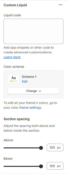
Custom Liquid
What is a custom liquid section?
A custom liquid section in the theme editor empowers experienced developers to incorporate unique and dynamic elements into Shopify stores by injecting bespoke code written in liquid. This tool provides greater creative control and personalization, allowing developers to extend the theme’s capabilities beyond built-in sections. However, caution is advised for those lacking expertise, as potential theme update issues may arise. Consider alternative approaches to avoid introducing risks or complexities.
How do you set up a custom liquid section?
- Go to the theme editor and add the custom liquid section.
- After adding the custom liquid section, find the option to modify it on the right side.
- Inside the custom liquid section, utilize the field provided to insert the liquid code. Include app snippets or other code for more advanced customizations.
- Select the color scheme for your custom liquid section from the four options provided.
- Finally, fine-tune the spacing above and below the section using the section spacing slider.
- Optionally, utilize the option to add custom CSS for incorporating unique styles to the section.
Divider
What is a divider?
A divider in the theme editor serves as a tool that allows you to control and enhance the spacing between two sections within your website. This feature plays a crucial role in optimizing the visual layout and overall aesthetic appeal of your site by providing a means to create well-defined and visually pleasing separations between different content areas. It grants you the flexibility to customize the spacing according to your design preferences, contributing to a more polished and organized appearance for a seamless user experience.
How to set up a divider?
- Navigate to the theme editor and insert a divider between the desired sections.
- On the right side, locate the option to manage the spacing range between the sections.
- Utilize the first slider to adjust the desktop margin-bottom, ranging from a minimum of -100px to a maximum of 100px.
- Use the second slider to modify the mobile margin-bottom, with a range from a minimum of -50px to a maximum of 50px.
- Optionally, utilize the option to add custom CSS for incorporating unique styles to the section.

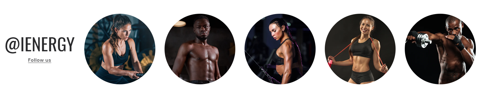
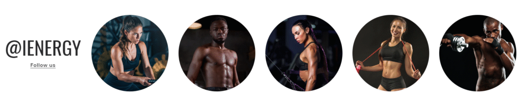
Image Gallery
What is an image gallery section?
An image gallery section in the theme editor is a customizable feature that enables users to display a collection of images in a visually appealing and organized manner on their website. This section allows you to showcase multiple images in a grid or carousel format, providing a user-friendly way to present visual content such as product photos, portfolio images, or any other visual elements relevant to your website’s purpose. Users can typically upload, arrange, and customize the appearance of images within the gallery section to enhance the overall aesthetic and engagement of their website.
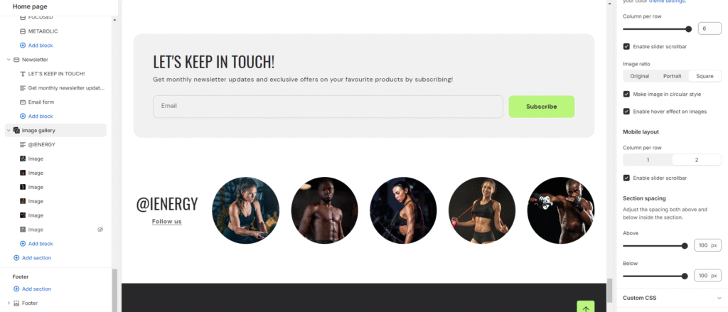
How to set up an image gallery section?
- Go to the theme editor and add the image gallery section.
- After integrating the image gallery section, customize its settings by accessing the options on the right side.
- Start by adding a heading to the section. Tailor the heading size and alignment according to your preferences from the provided options.
- Directly below, manage the layout of the image gallery section. Choose a color scheme from the four available options.
- Specify the range for displaying the columns per row. Opt to enable the slider scrollbar for a visual presentation of images in a scrollbar, or, if disabled, the images will be visible in a second row based on the selected columns per row.
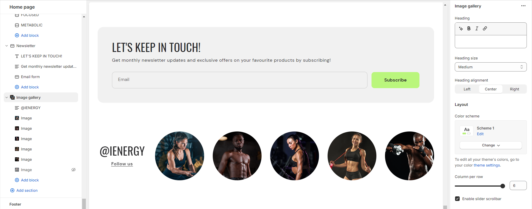
6.Opt for the image ratio from three available options: Original, Portrait, and Square. Additionally, enable the circular style for images and activate hover effects as desired.
7.Choose the number of columns per row you wish to display for the mobile layout.
8.Fine-tune the spacing above and below the section using the section spacing slider.
9.Lastly, access Theme Settings to enable the Sequential Sections on the Scroll option.
10.Optionally, utilize the option to add custom CSS for incorporating unique styles to the section.

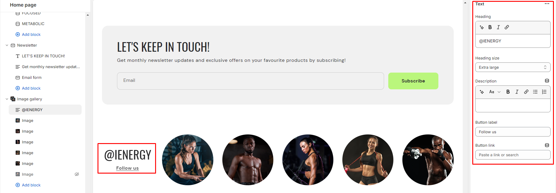
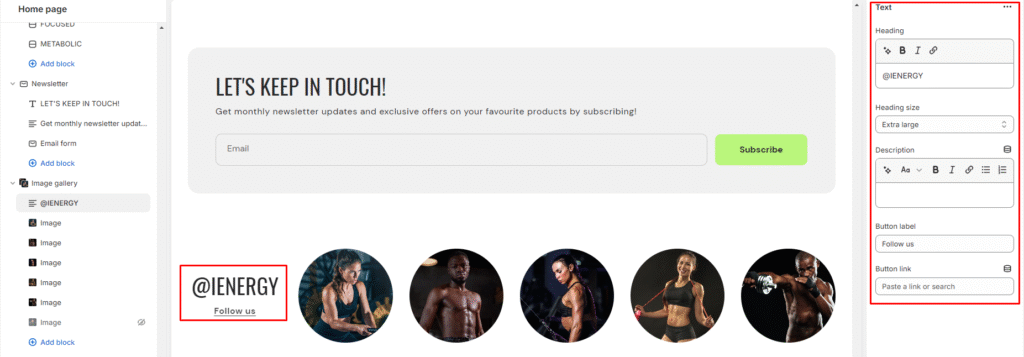
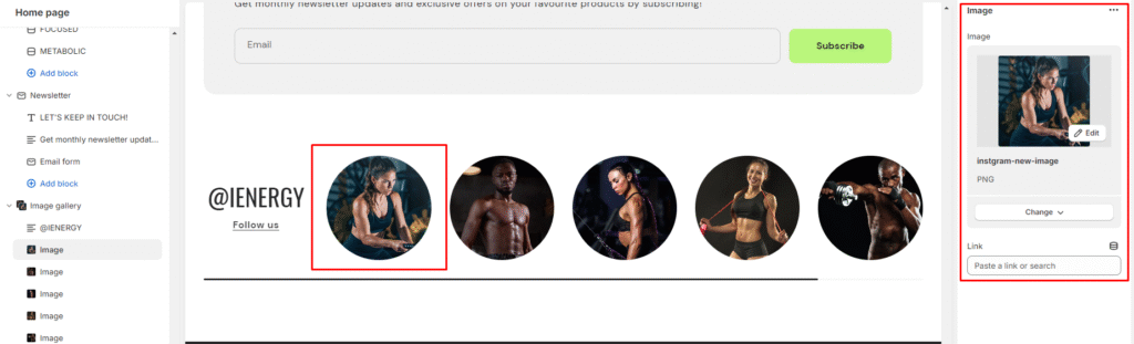
Add Blocks
- Once the image gallery section is added, you can choose to include both image and text blocks within that section.
- After adding the image and text block, you’ll find options to customize each block.
- By clicking on the text block, customization options will appear on the right side.
- Choose the heading you want for the image gallery and select its size from the available options: Small, Medium, Large, Extra Large.
- Describe your image gallery in the provided fields, and enhance customer experience by adding a button label and linking it.
6.Similarly, you can customize your image block on the right side.
7.Here, you can add the image and insert its corresponding link.

Scrolling Text
What is a scrolling text section?
A scrolling text section in the theme editor is a customizable component that allows users to display text that moves horizontally across a specified area on their website. This dynamic feature is often used to highlight important messages, announcements, or promotional content in a visually engaging manner. Users can typically control the speed, space, and styling of the scrolling text, providing a dynamic and attention-grabbing element to enhance the overall design and interactivity of their website. This section is handy for conveying information in a space-efficient way, especially when dealing with limited-screen real estate.

How do you set up a scrolling text section?
- Navigate to the theme editor and add the scrolling text section.
- Customize the settings of the image scrolling text section by accessing the options located on the right side after its addition.
- You can manage the layout of the section by enabling the expand width option.
- Choose a color scheme from the four available options and adjust the text size using the size option provided.
- Next, you can adjust the scrolling speed to be Slow, Medium, or Fast.
- Enable the bottom sticky option. This setting is effective when the scrolling text is positioned below the footer section.
Add Blocks
- After successfully adding the scrolling text section, you have the option to include both the scrolling text and scrolling social links block within this section.
- Upon adding the scrolling text block, you’ll discover customization options available on the right side.
- Enter the desired text and link in the provided field, which users can access by clicking on the text.
- Additionally, you can activate the “Fill text stroke” feature to modify the style of the scrolling text.
- Likewise, for the scrolling social links, you need to link your social media accounts in the theme settings.

7.Fine-tune the spacing above and below the section using the section spacing slider.
8.You also have the option to add social links for platforms such as Facebook, Instagram, YouTube, TikTok, Twitter, Pinterest, Snapchat, Tumblr, and Vimeo.
9.Optionally, you can utilize the custom CSS option to incorporate unique styles into the section.
Add Blocks
- After successfully adding the scrolling text section, you have the option to include both the scrolling text and scrolling social links block within this section.
- Upon adding the scrolling text block, you’ll discover customization options available on the right side.
- Enter the desired text and link in the provided field, which users can access by clicking on the text.
- Additionally, you can activate the “Fill text stroke” feature to modify the style of the scrolling text.
- Likewise, for the scrolling social links, you need to link your social media accounts in the theme settings.

Pop-Ups
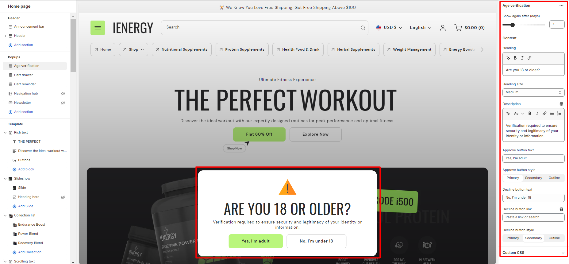
Age Verification
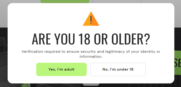
What is an age verification popup?
An age verification popup is a type of pop-up window that appears when a visitor accesses a website, prompting them to confirm their age before proceeding further. This popup is commonly used on websites that contain age-restricted content, such as alcohol or tobacco products, gambling sites, or adult content platforms. The purpose of the age verification popup is to ensure that visitors are of legal age to access the content or make purchases on the site, helping businesses comply with legal requirements and promote responsible consumption.
How to set up an age verification popup?
- Navigate to the “Popup” section and click on “Age Verification Popup.”This action will open up the settings for the Age Verification Popup on the right side of the screen.
- Start by selecting the number of days after which you want to display the Age Verification Popup again when a person visits the site.
- Add the heading for the Age Verification Popup. For example, you can use text like “Are you 18 or older?” and adjust the heading size from the available options.
- You also have the option to add a description below the heading. This text will be visible under the heading in the popup.
- Specify the text for the approve button (e.g., “Yes, I’m 18+”) and choose the button style from the available options.
- Similarly, set the text for the decline button (e.g., “No, I’m under 18”), specify the link where customers will be directed after clicking on the decline button, and choose the button style for the decline button.
- Optionally, you can add custom CSS to the Age Verification Popup section to incorporate unique styles that align with your website’s design and branding.
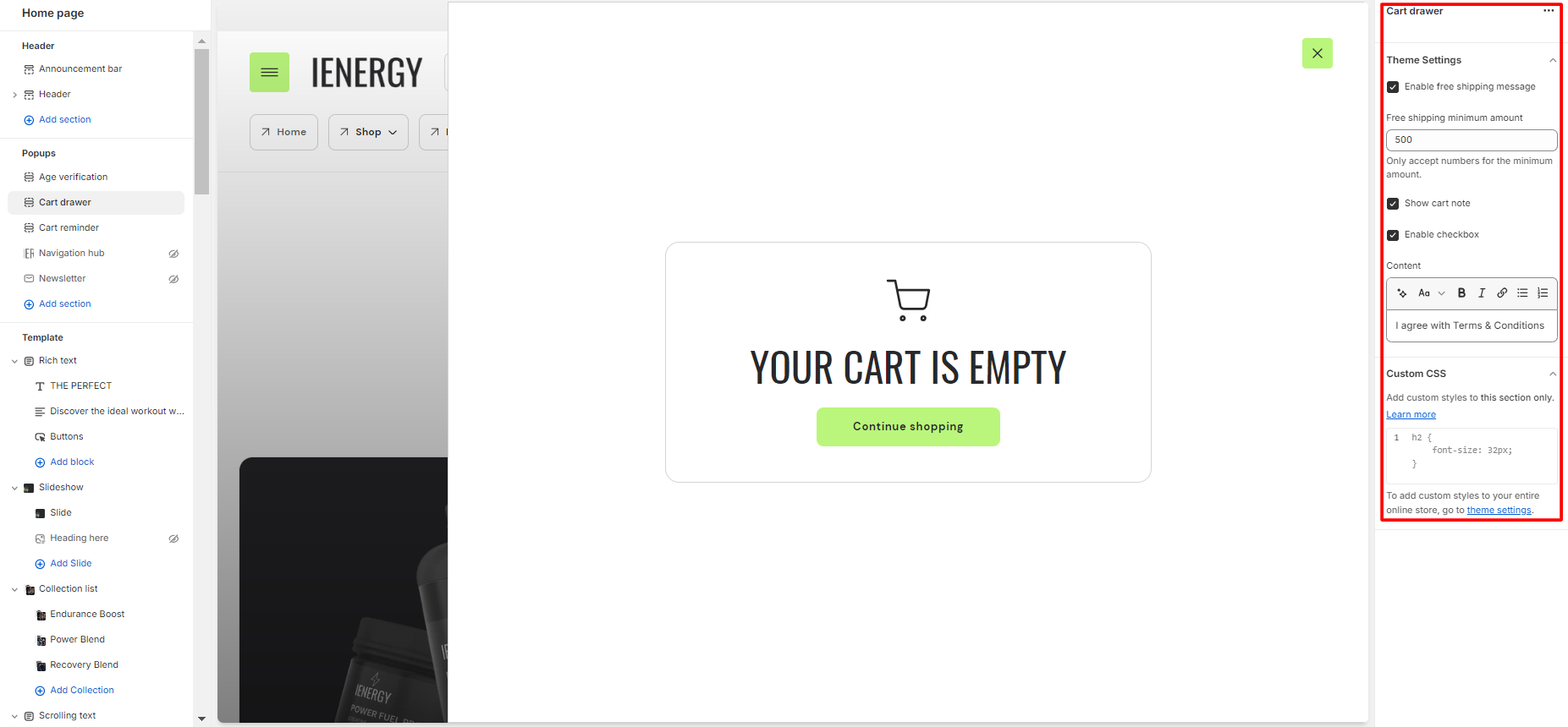
Cart Drawer
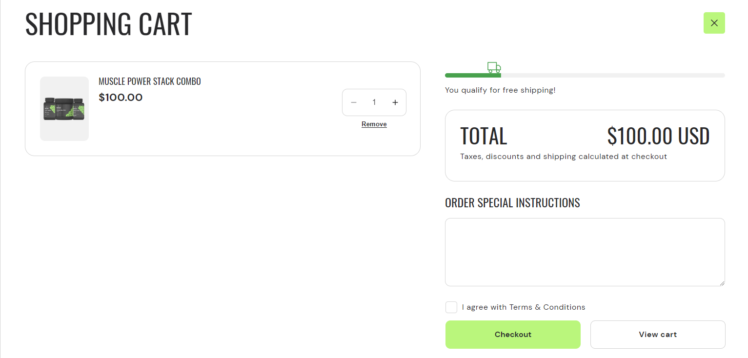
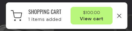
What is a cart drawer popup?
A cart drawer popup in a theme refers to a small interactive window that appears on a website when a user adds an item to their shopping cart. Instead of redirecting the user to a separate page to view their cart, the cart drawer popup allows them to see a summary of their cart contents directly on the same page they are currently on.
The cart drawer typically includes information such as the items added, quantities, prices, and a subtotal. It may also provide options to update quantities, remove items, or proceed to checkout without leaving the current page. Cart drawer popups are designed to enhance the user experience by providing a convenient and seamless way to manage shopping cart items without interrupting their browsing flow.
How to set up a cart drawer popup?
- Go to the “Popup” section and select “cart drawer popup.”
- Within this section, you can adjust the settings to either hide or show the cart drawer popup.If the cart drawer is not hidden, it will appear on your website when a user adds an item to their cart. This feature avoids redirecting the user to a separate page to view their cart.
- Additionally, explore the theme settings to access cart options and you can also add custom CSS to apply unique styles to the popup section if desired.
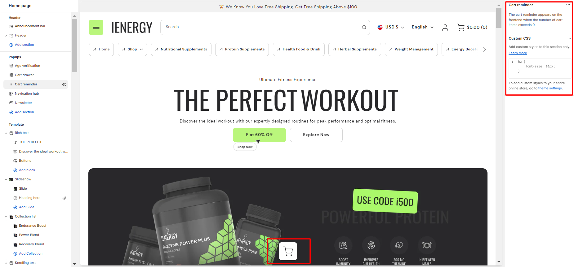
Cart Reminder
What is a cart reminder popup?
A cart reminder popup in a theme is a feature that prompts users who have added items to their shopping cart but have not yet completed the checkout process. This popup is designed to remind users of their pending items in the cart and encourage them to finalise their purchase. Typically, the cart reminder popup appears on the website after a specified period of inactivity or when the user attempts to navigate away from the page without completing the purchase.
How to set up a cart reminder popup?
- Go to the “Popup” section and select “cart reminder popup.”
- Within this section, you can adjust the settings to either hide or show the cart reminder popup.
- The cart reminder appears on the frontend when the number of cart items exceeds 0.
- Additionally, explore the theme settings to access cart options and you can also add custom CSS to apply unique styles to the popup section if desired.
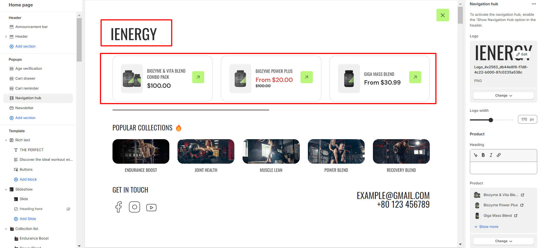
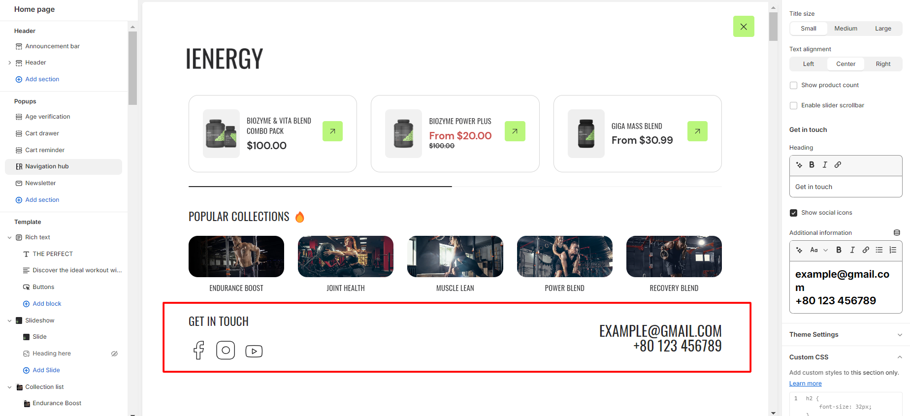
Navigation Hub
What is a navigation hub?
A navigation hub in a theme refers to a centralized location or interface that allows users to easily navigate through different sections or pages of a website. It serves as a hub or central point from which users can access various parts of the site without having to go back to the homepage or use multiple menus.
The navigation hub typically includes links or buttons to key sections such as Home, About Us, Contact, and any other relevant pages. It may also incorporate dropdown menus or sub-menus for organizing and presenting a hierarchical structure of the website’s content.
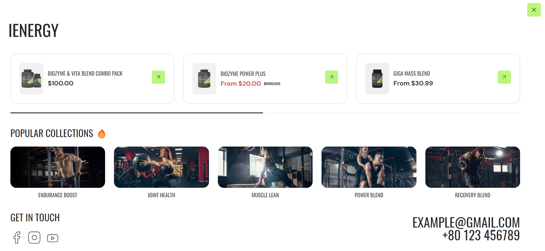
How to set up a navigation hub?
- Go to the “Popup” section and select ” navigation hub” Upon selection, you will get the settings for the navigation hub on the right side of the screen.
- To activate the navigation hub, enable the “Show Navigation Hub” option from the header section.
- From the settings, select the logo for the navigation hub and adjust the logo width of the logo.
- Manage the Product section by adding a heading in the provided field.
- Select the desired products to display in this section from the product list.
6.Choose the image ratio for the products: Portrait or Square.
7.Enable the slider scrollbar if you want the products to be visible upon scrolling; otherwise, all products will be shown.
8.Optionally, enable the “Show Quick View” button for products.
9.Similarly, manage the Collection section by adding a heading for the collections.
10.Select the collections to include in this section.
11.Choose the image ratio for the collections: Original, Portrait, Square, or adjust using a Custom ratio.
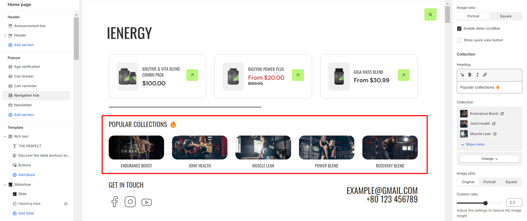
12.Customize the title size and text alignment for the collection.
13.Enable the “Show Product Count” option to display the product count in the collection.
14.Optionally, enable the slider scrollbar for the collections to be visible upon scrolling.
15.Add a heading for the “Get in Touch” section and provide additional information, including social links.
16.Finally, access Theme Settings and consider adding custom CSS for unique styling options for the navigation hub.
Newsletter
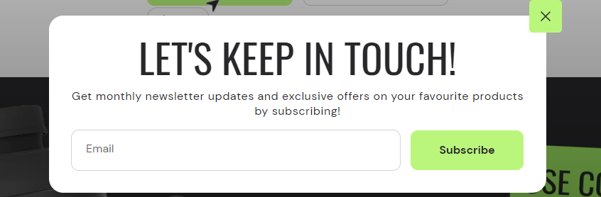
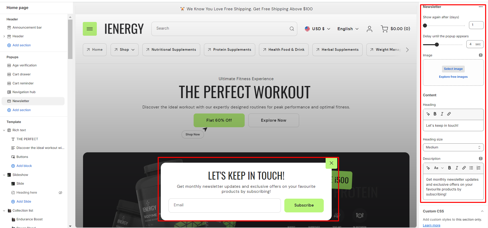
What is a newsletter popup?
A newsletter popup in a theme is a type of modal window that appears on a website to prompt visitors to subscribe to the site’s newsletter or mailing list. This popup usually displays a form where users can enter their email address and sometimes additional information such as their name or interests. The purpose of the newsletter popup is to capture leads and build an email subscriber list for marketing purposes.
The navigation hub typically includes links or buttons to key sections such as Home, About Us, Contact, and any other relevant pages. It may also incorporate dropdown menus or sub-menus for organizing and presenting a hierarchical structure of the website’s content.
How to set up a newsletter popup?
- Navigate to the “Popup” section and click on “Newsletter Popup.”
- This action will open up the settings for the Newsletter Popup on the right side of the screen.
- Start by selecting the number of days after which you want to display the Newsletter Popup again when a person visits the site.
- Select the duration for when you want the newsletter popup to appear after the site is opened.
- Add the heading for the newsletter popup and manage the heading size from the available options.
- You also have the option to add a description below the heading. This text will be visible under the heading in the popup.
- Optionally, you can add custom CSS to the newsletter popup section to incorporate unique styles that align with your website’s design and branding.
Template
Featured collection
What is a featured collection section?
A featured collection section in a theme is a visually striking area that highlights curated products or content. Typically found in e-commerce websites or blogs, this section showcases selected items that are relevant to a specific theme or category. It often includes eye-catching images, brief descriptions, and links to the individual products or pages. The purpose of a featured collection section is to grab the attention of visitors, promote specific items or content, and encourage exploration or sales. It’s an effective tool for showcasing the best of what a website has to offer in a visually appealing and organized manner.
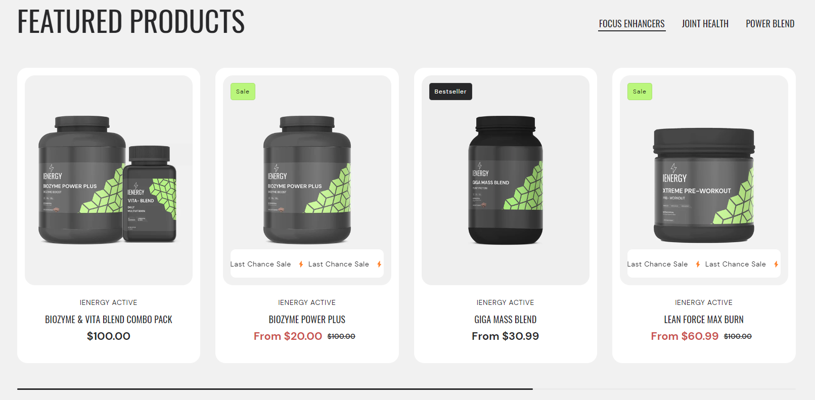
How to set up the featured collection section?
- Navigate to the template section and add the featured collection section, where you’ll find customization options on the right.
- Add a heading for the featured collection, adjust its size and alignment as needed.
- Choose a color scheme from the provided options.
- Use sliders to set the maximum number of products and products per row.
- Enable the slider scrollbar or “View All” button for collections with more products.
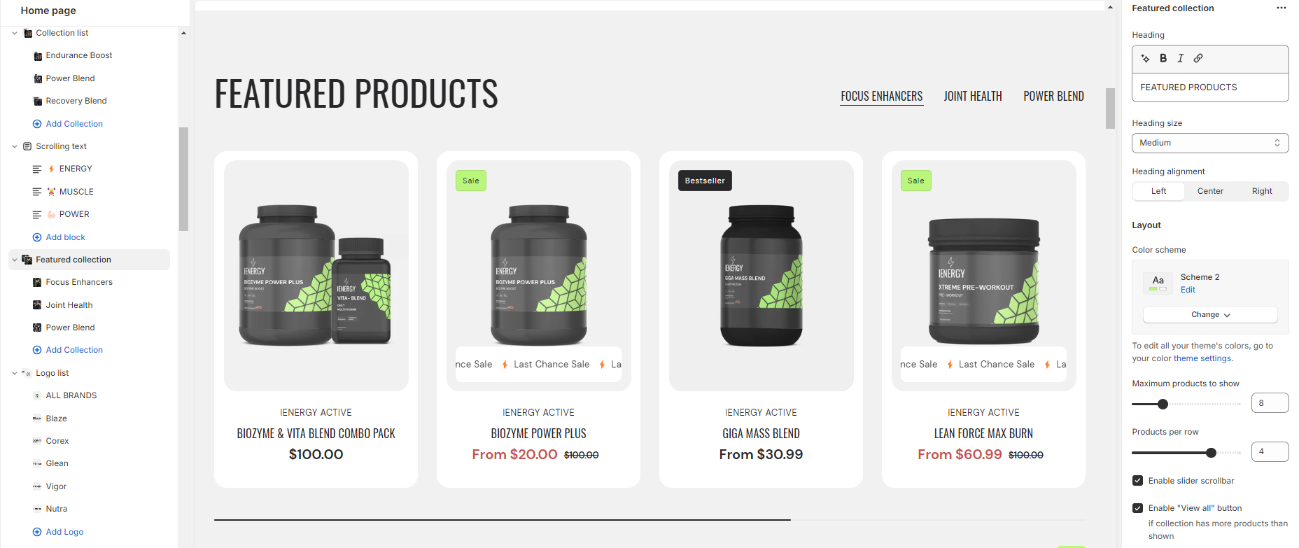
6.Customize the product grid’s color scheme.
Select a product grid style and image ratio.
7.Enable options like showing the second image on hover, displaying vendor information, product ratings, quick view button, and color swatches.
8.Adjust content alignment for the product grid.
9.Manage the mobile layout by setting products per row and enabling the slider scrollbar.
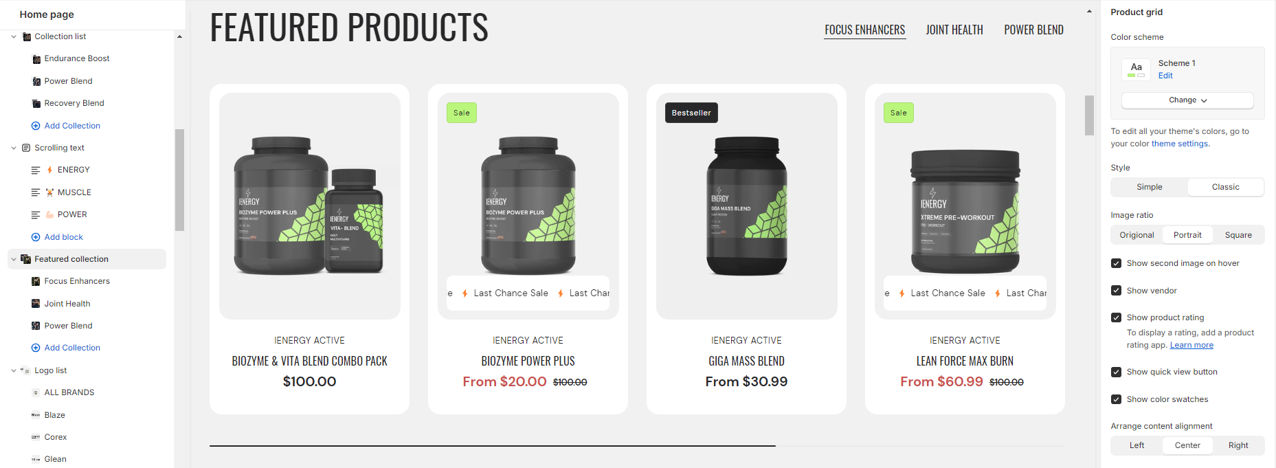
10.Fine-tune spacing above and below the header section using the spacing slider.
11.Optionally, configure theme settings and add custom CSS for unique styles.
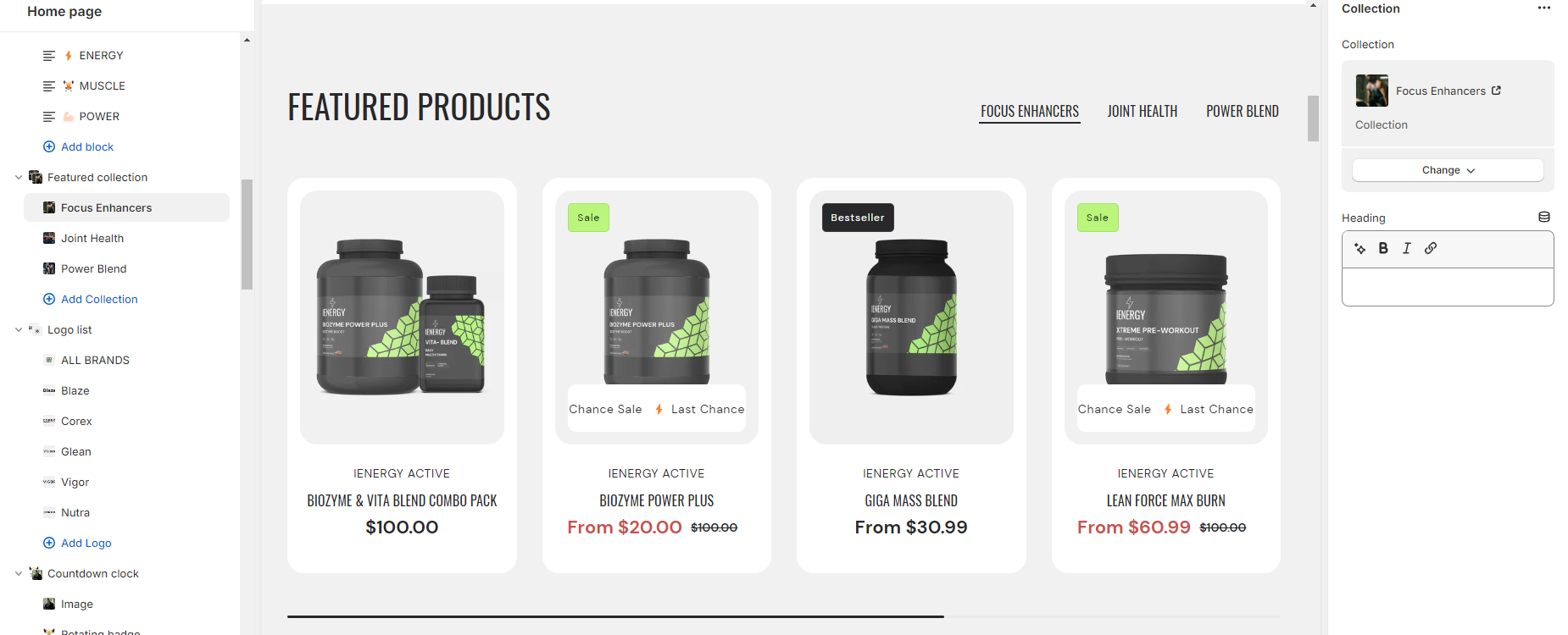
Add Blocks
- In the featured collection section, you can add up to five collection blocks.
- After adding a block, you’ll have the option on the right side to select which collection to display in that block and to add a heading for each block.
Featured product
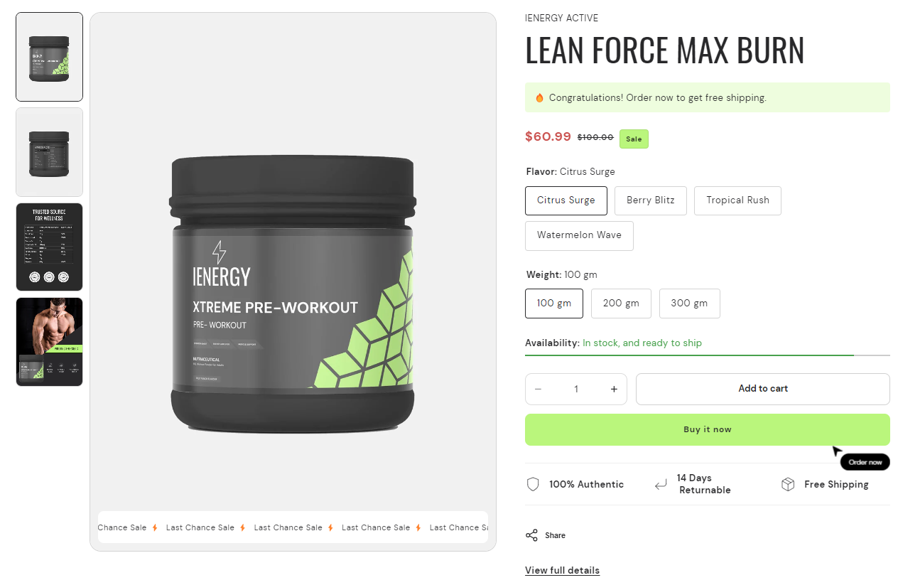
What is the featured product section?
A featured product in themes typically refers to a specific product or item that is highlighted or showcased prominently on a website or platform. It is often displayed in a visually appealing manner, such as with larger images, special design elements, or positioned in a prominent location on the page. Featuring a product can help draw attention to it, increase its visibility, and encourage visitors to explore or purchase it.
How to set up a featured product section?
- Begin by navigating to the template section and adding the featured product section, where customization options are available on the right side of the screen.
- Choose the product you want to showcase as the featured product.
- Select a color scheme for the featured product from the available options.
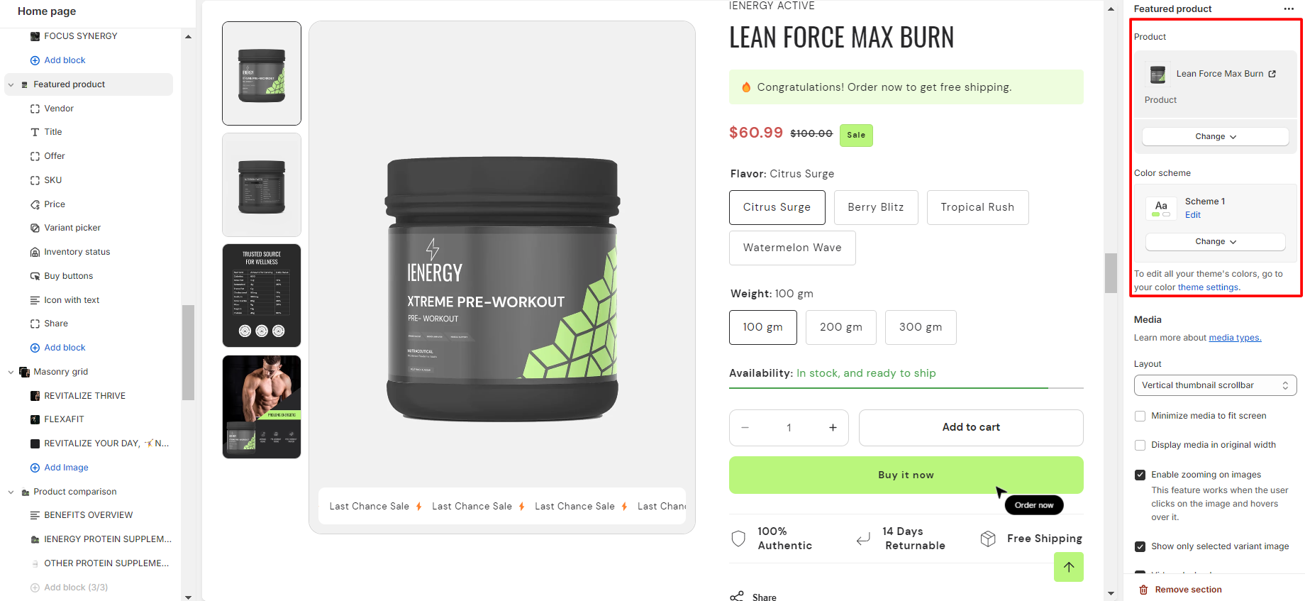
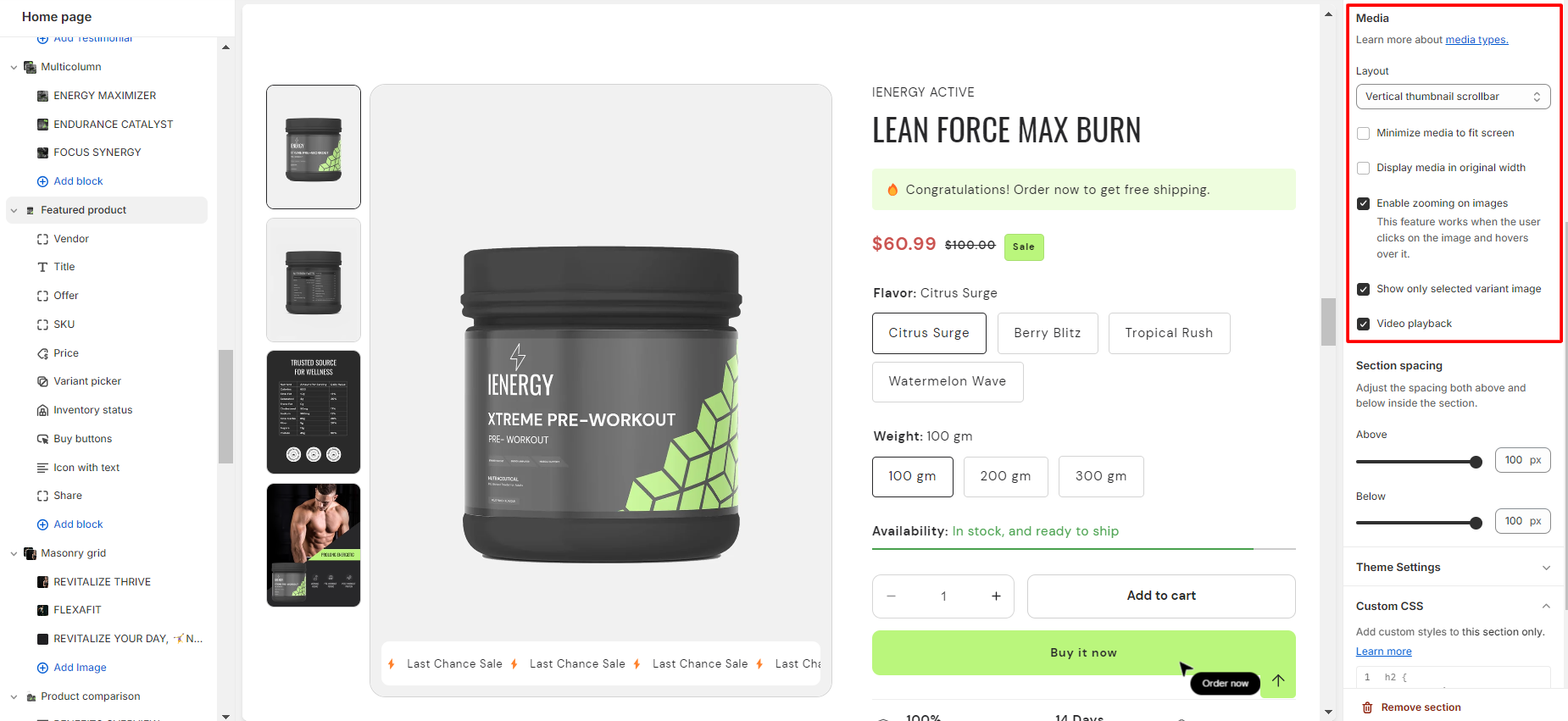
4.Customize the layout of the featured product based on your preferences.
5.Enable the option to minimize media to fit the screen if desired.
6.Optionally, enable the display of media in its original width.
7.Enable zooming on images for an interactive user experience.
8.Select the option to show only the selected variant image if applicable.
9.Add the video playback feature to enhance product presentation.
Add Blocks
- In the featured product section, you can add blocks and customize them according to your needs.
- Here are the available blocks for your featured products section:
- Offer
- Content
- Title
- Price
- SKU
- Inventory status
- Variant picker
- Buy buttons
- Share
- Custom Liquid
- Product rating
- Icon with text
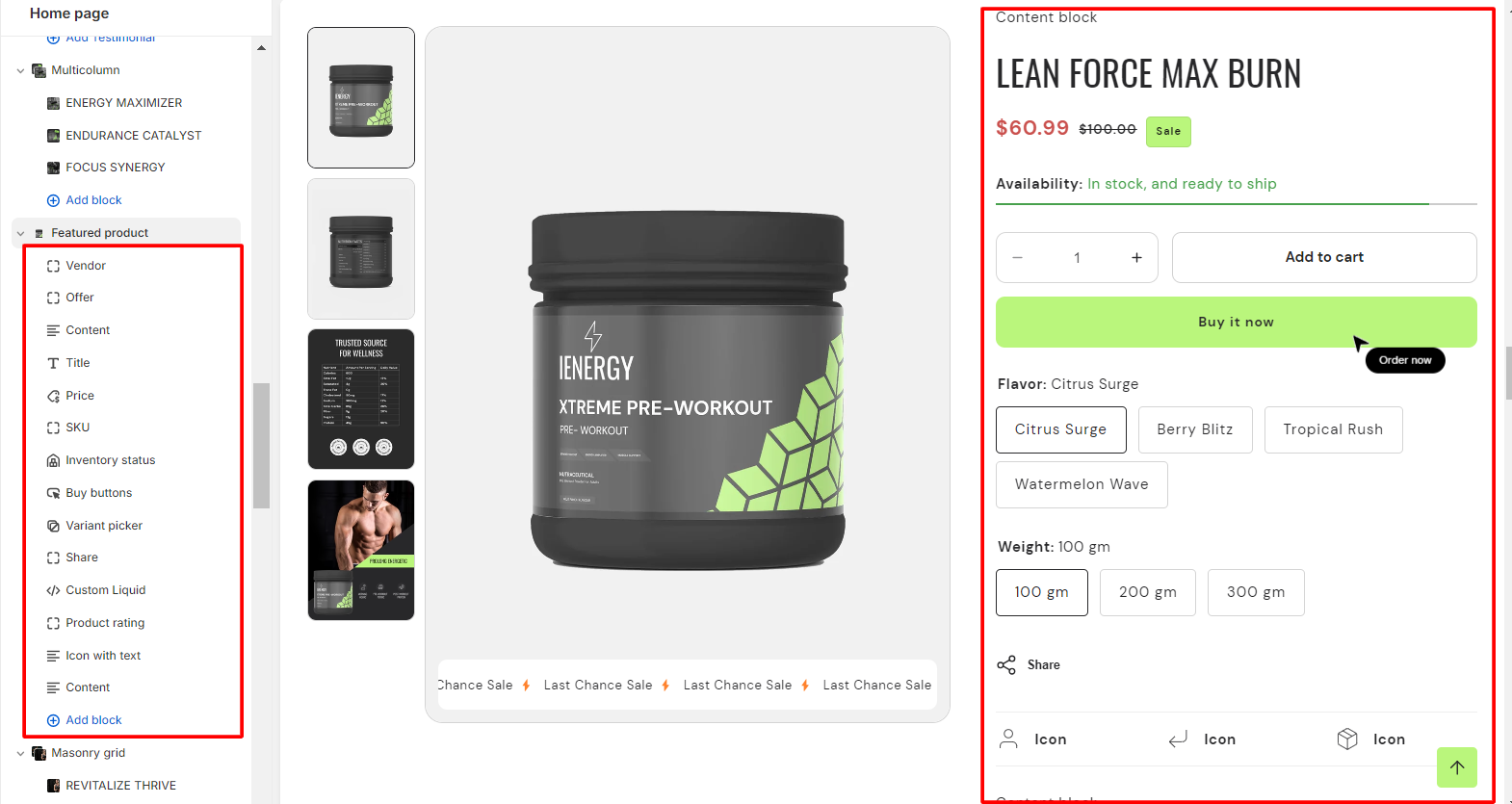
3. Select the blocks you want to include and customize them using the options provided.
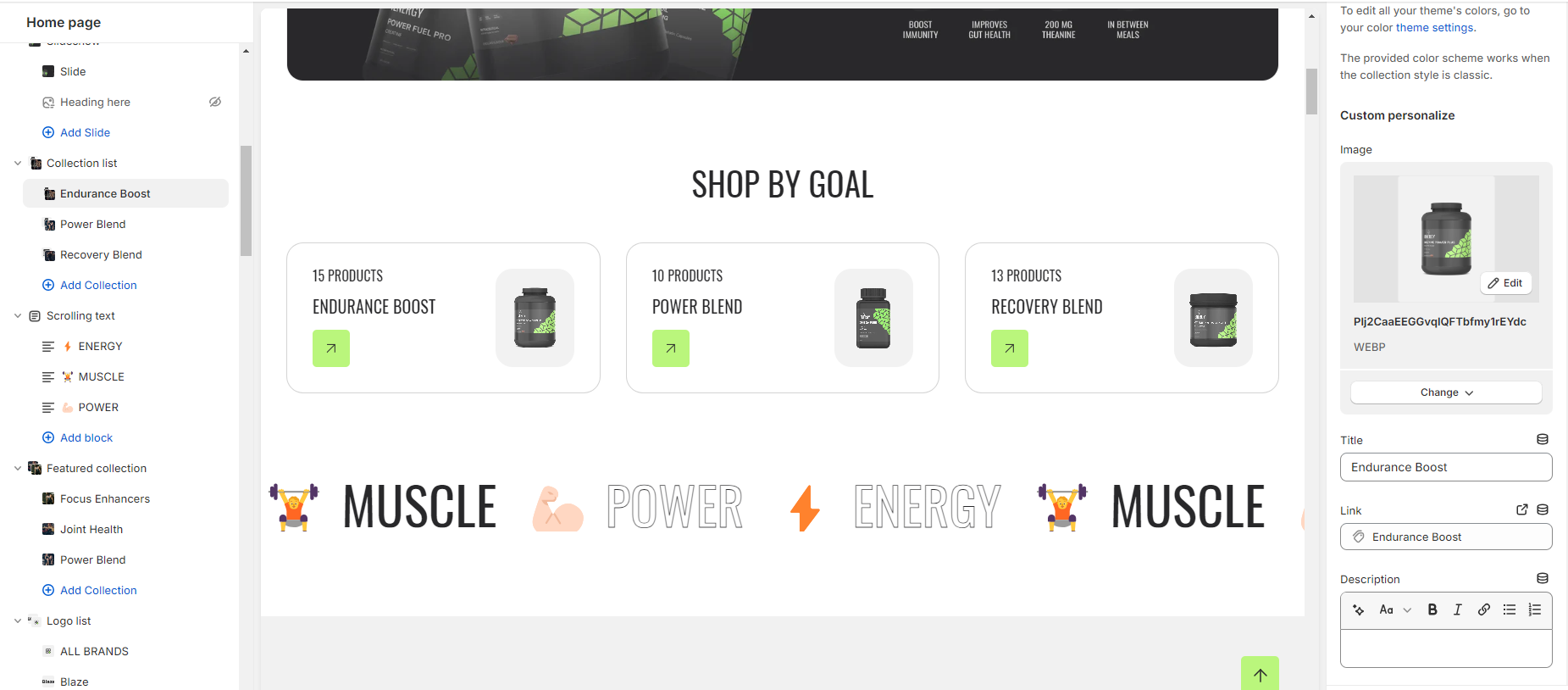
Collection list
What is a collection list section?
The Collection List section typically includes customizable features such as the number of items displayed per row, the order of items, image sizes, and text formatting. This section helps visitors quickly navigate and explore different categories or collections offered on the website, enhancing the user experience and encouraging engagement
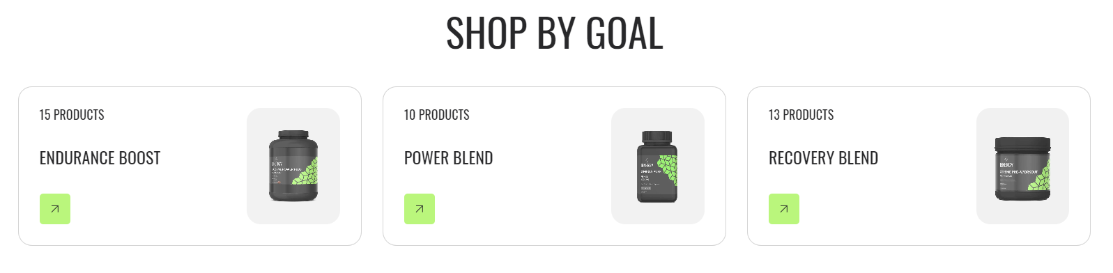
How to set up a collection list section?
- Navigate to the template section and add the collection list section, where you’ll find customization options on the right.
- Add a heading for the collection list, adjust its size and alignment as needed.
- Choose a color scheme from the provided options.
- Use sliders to set the maximum number of collection per row.
- Activate the slider scrollbar or Enable the “View all” button. This feature is functional only if the list contains more collections than are currently displayed.
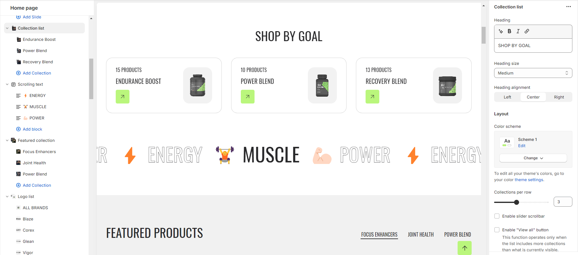
6.Customize the collection grid by adjusting the style and image width.
7.Select an image ratio from three options: Original, Portrait, and Square. Optionally, set a Custom ratio.
8.Choose the title size and arrange content alignment from the available options.
9.Enable the option to show product count if needed.
10.Manage the mobile layout by selecting the desired number of collections per row and optionally enabling the slider scrollbar.
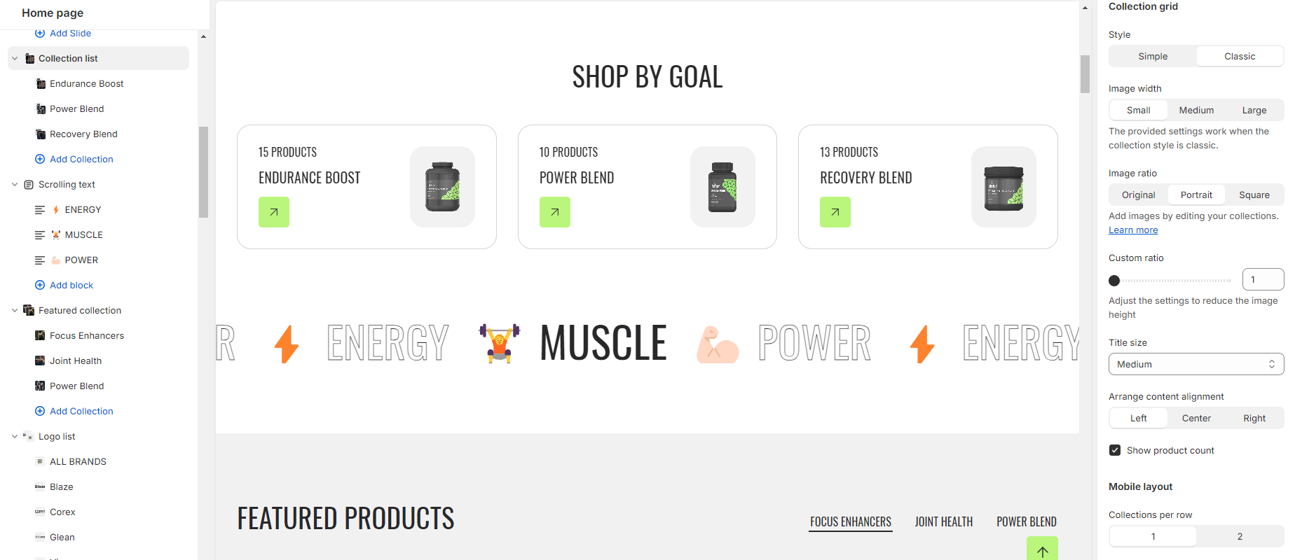
11.Fine-tune spacing above and below the header section using the spacing slider.
12.Additionally, you can configure theme settings and apply custom CSS for unique styles as per your preference.
Add Blocks
- Add the collection block and select the collection you wish to display.
- Customize the Color scheme for the collection list block.
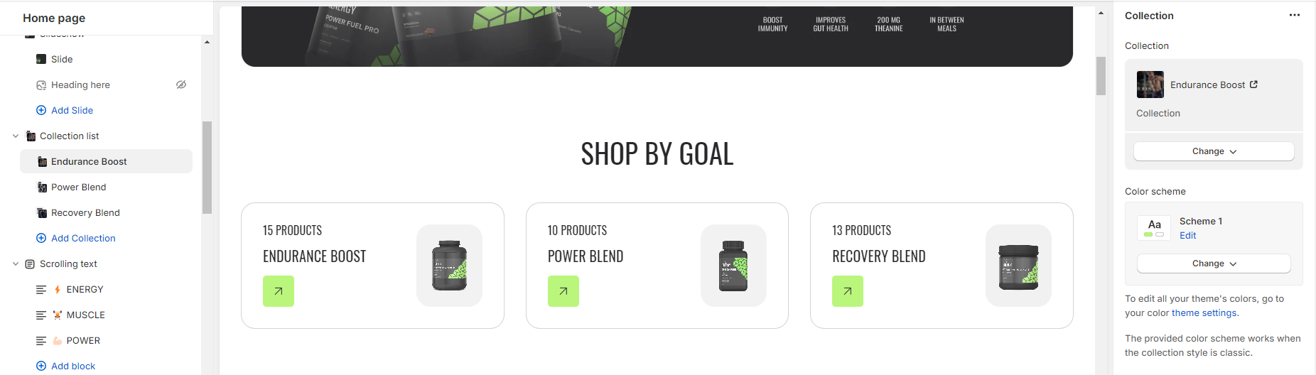
3.Upload images to represent each item in the collection list.
4.Set the Title for each item.
5.Provide a Link for each item either by pasting a link or searching for it.
6.Add a Description for each item to provide more context or information.
Rich text
What is a rich text section?
A rich text section refers to a customizable content block that allows you to add and format text, images, and other multimedia elements on your online store. Rich text sections are commonly used to create engaging and visually appealing content, such as product descriptions, promotional banners, and informational pages
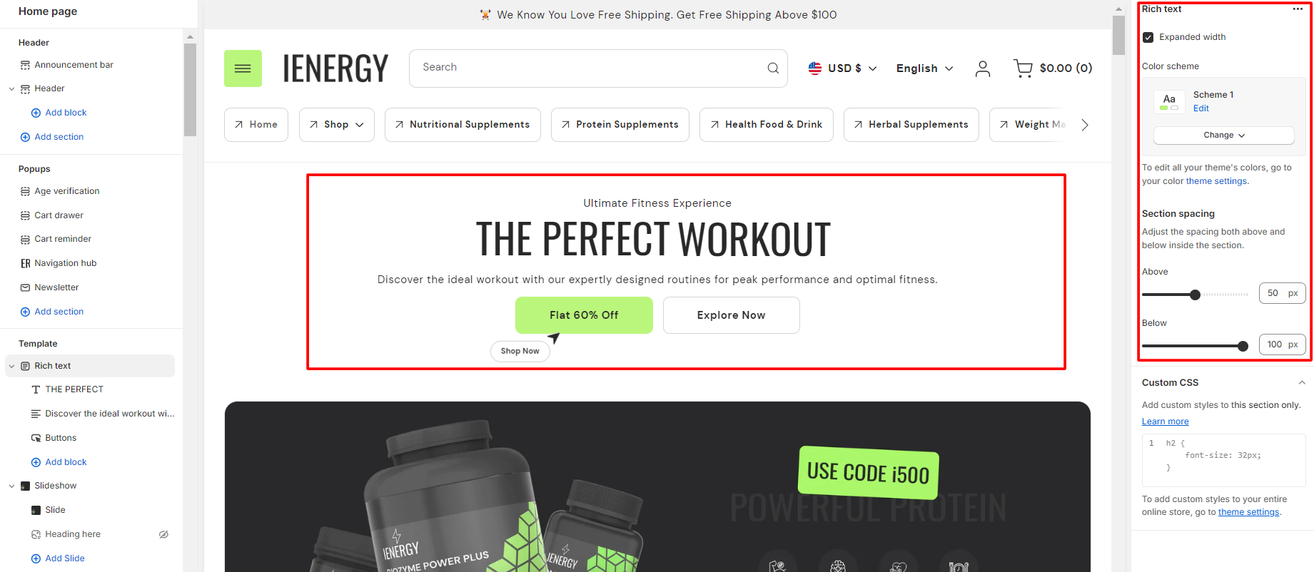
How to set up a rich text section?
- Navigate to the template section and add the rich text section, where you’ll find customization options on the right.
- Adjust the layout of the section by enabling the “expand width” option.
- Choose a color scheme for your rich text section from the four options provided.

4.Fine-tune the spacing above and below the section using the section spacing slider.
5.Additionally, you can configure theme settings and apply custom CSS for unique styles as per your preference.
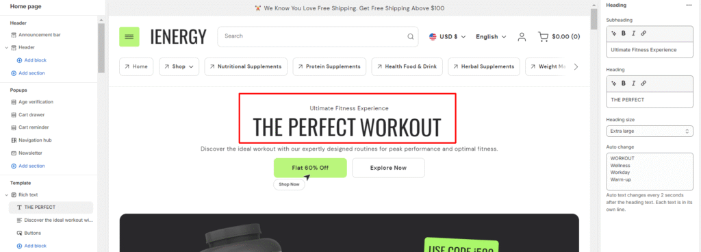
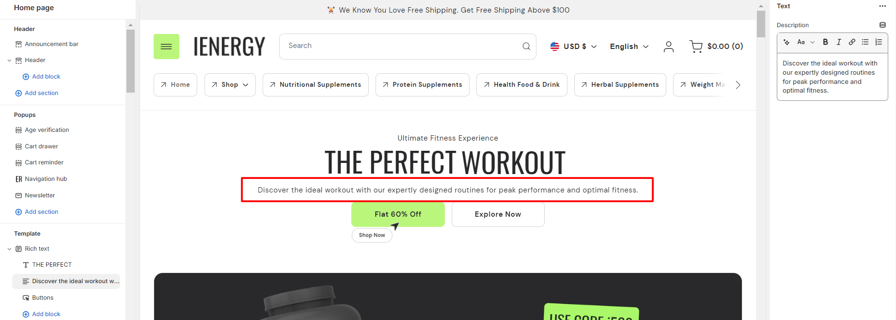
Add Blocks
- In the rich text section, add and locate the heading block settings on the right side.
- Enter your desired subheading text in the provided field.
- Optionally, set the heading by entering text in the field and choose the heading size from the available options.
- Enter the text you want to auto change in the auto change field.
5.Then in the text block, enter your description text.
6.Lastly in the button block manage the button settings.
7.Enter the primary button label text in the field.
8.Provide suggestions or instructions for the primary button.
9.Paste or search for the link you want the primary button to navigate to.
10.Choose the style for the primary button from the available options.
11.Optionally, configure a secondary button by entering its label, suggestions, link, and style in the corresponding fields.
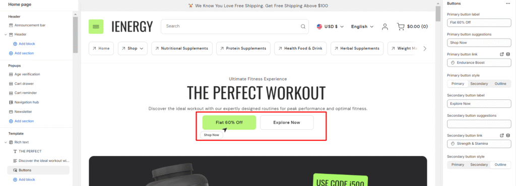
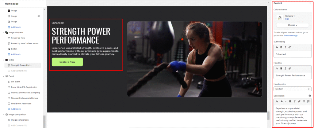
Image with text
What is an image with text section?
An “image with text” section, refers to a content block that combines an image with accompanying text. This type of section is often used to showcase products, services, or featured content in a visually appealing and informative way. It is a versatile and effective way to present content that combines visual elements with informative text, helping to engage visitors and communicate key messages on a website or online store.
How to set up an image with text section?
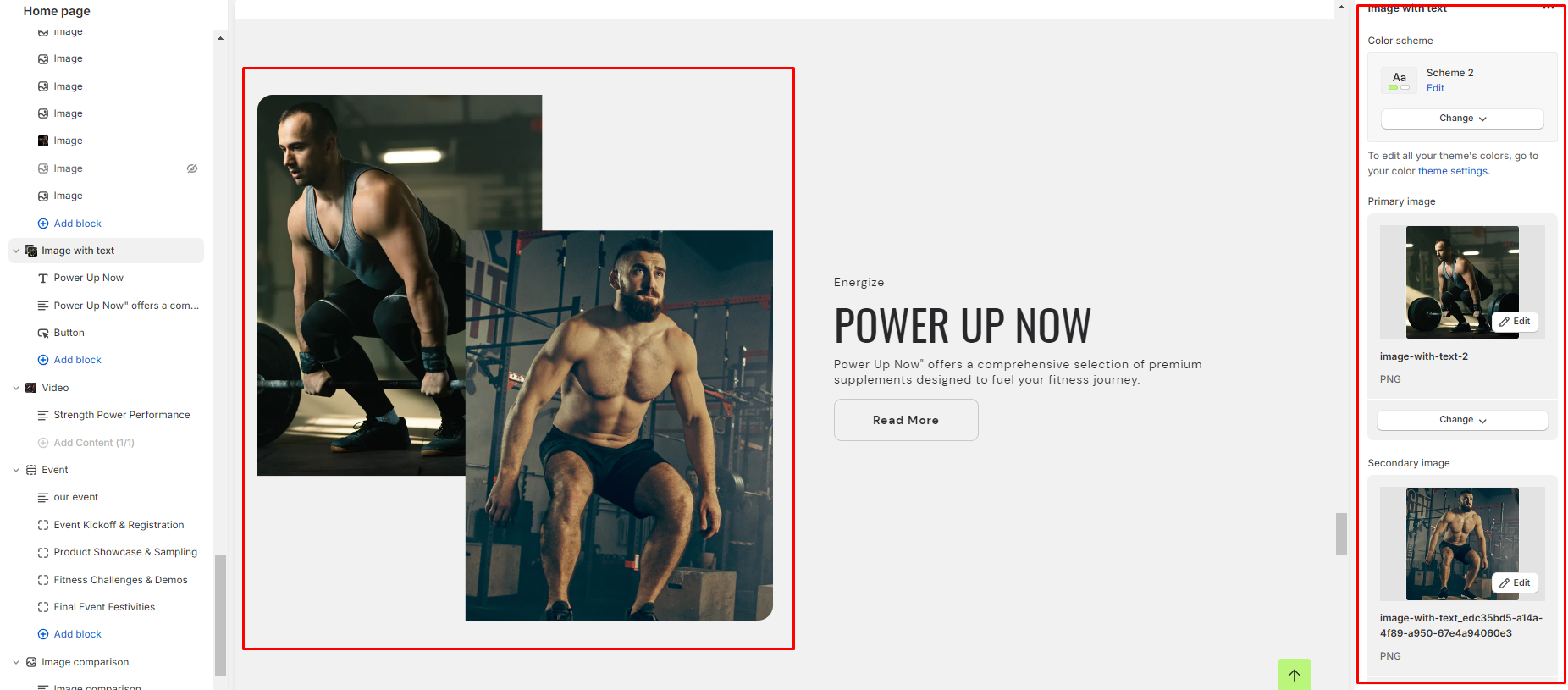
- Navigate to the template section and add the image with text section, where you’ll find customization options on the right.
- Choose a color scheme for the section.
- Add the primary and secondary images to the section.
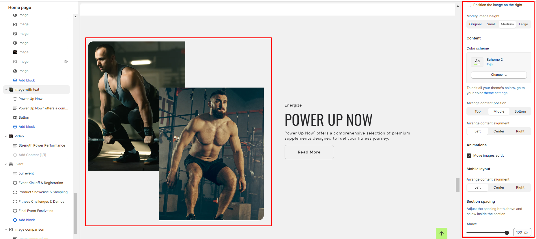
- Enable the option to position the image on the right side of the text.
5.Modify the height of the images as desired.
6.Define the color scheme for the content text.
7.Arrange the position of the content within the section.
8.Adjust the alignment of the content within the section.
9.Apply animations to softly move the images.
10.For mobile layout, arrange the alignment of the content to ensure responsiveness.
11.Fine-tune the spacing above and below the section using the section spacing slider.
12.Optionally, configure theme settings and apply custom CSS for unique styles according to your preference.
Add Blocks
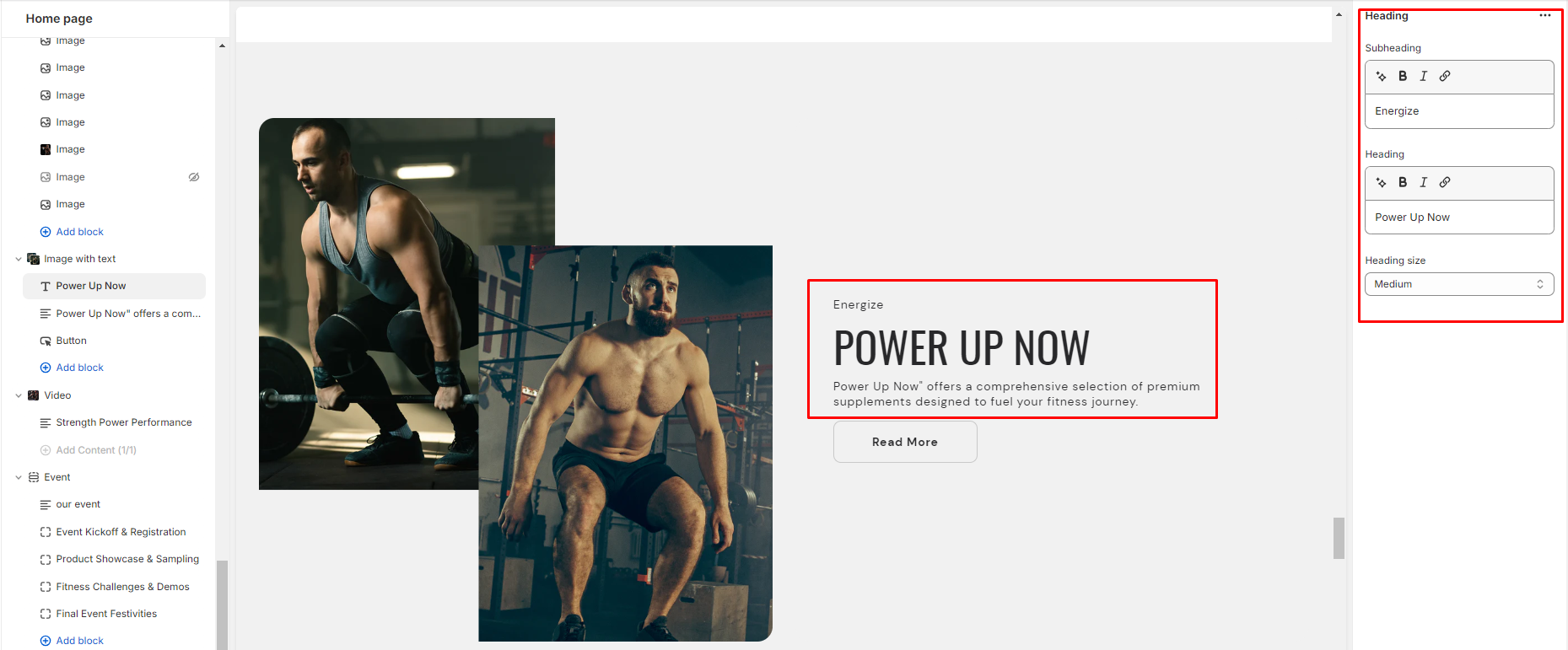
- In the image with text section, add and locate the heading block settings on the right side.
- Enter your desired subheading, heading texts in the provided field and choose the heading size.
3.Then in the text block, enter your description text.
4.Enter the button label and link you want the button to navigate to in the button block
5.Lastly choose the button style.
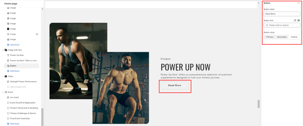
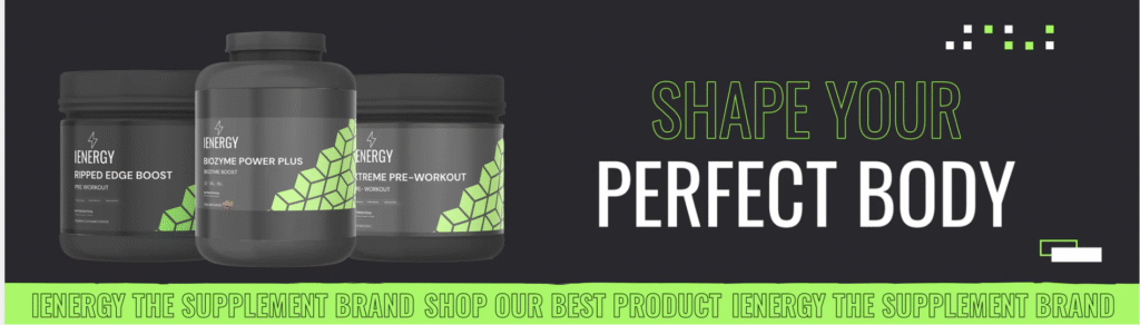
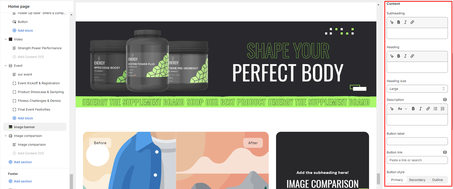
Image banner
What is an image banner section?
An image banner section, also known simply as a banner section, is a prominent element often found at the top of a webpage or within a website’s layout. It typically consists of a visually appealing image or a series of images accompanied by text, buttons, or other elements. The primary purpose of an image banner section is to grab the attention of visitors and convey key messages or branding information effectively.
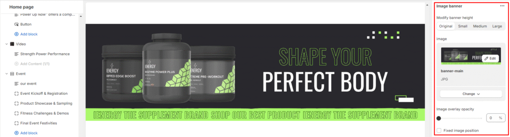
How to set up an image banner section?
- Navigate to the template section and add the image banner section, where you’ll find customization options on the right.
- Choose the desired size for the banner height.
- Upload images for the banner from your device or click “Explore free images” to browse and select images from a library.
- Adjust the image overlay opacity if needed (from 0 to 100).
5.Choose whether to fix the image position or let it adjust with the content.
6.Add a subheading, heading for the banner and choose the heading size.
7.Provide a description for the image to showcase your brand to a wider audience.
8.Specify the label for the button(s) and paste the link(s) for their respective destinations.
9.Then, select the style for the button.

10.Arrange the position of the content within the banner.
11.Choose whether to show content with a background or not and align the content within the banner.
12.Customize the color scheme for the section using the available options.
13.For mobile layout, adjust the alignment of the content and choose whether to display content below the images or not.
14.Fine-tune the spacing above and below the section using the section spacing slider.
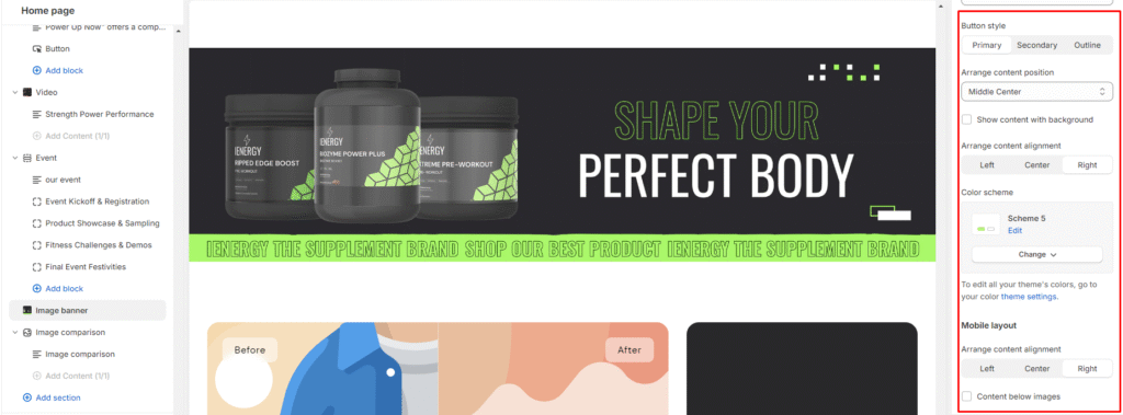
15.Optionally, configure theme settings and apply custom CSS for unique styles according to your preference.
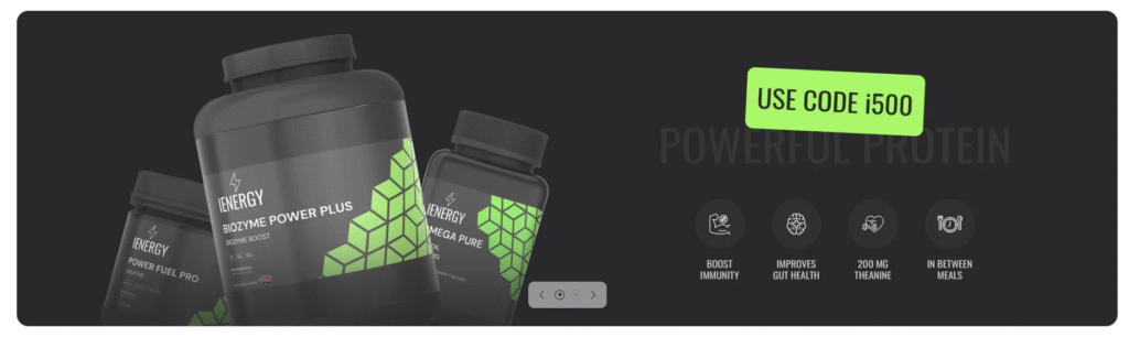
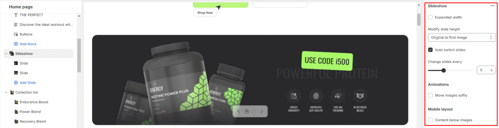
Slideshow
What is a slideshow section?
A slideshow section refers to a portion of a website where a series of images or slides are displayed in sequence. This section is designed to visually present information, ideas, or concepts to an audience in an organised and engaging manner. It may feature a carousel of images or banners that automatically rotate or can be manually navigated by users. This type of section is commonly used on homepages or landing pages to showcase products, services, promotions, or featured content.
How to set up a slideshow section?
- Navigate to the template section and add the slideshow section.
- Customize the slideshow section using the options available on the right side.
- Adjust the width of the slideshow to expand width.
- Modify the height of each slide from the available options.
- Enable auto-switching between slides and set the interval to change slides.
- Choose the soft animation effect for transitioning between images.
- Optimize the layout for mobile devices and select whether to display content below images or not.
Add Blocks
- In the slideshow section, add a slide block and locate its settings on the right side.
- Upload an image for the slide and add a specific image for mobile devices if needed.
- Adjust the opacity of the image overlay if desired.
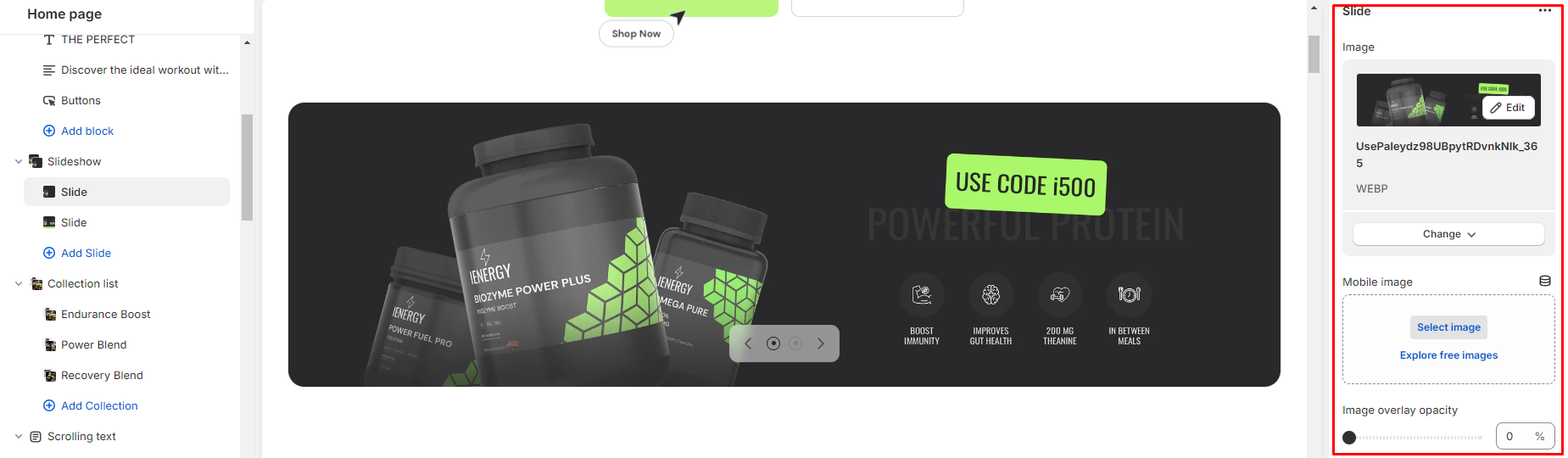
4.Add a subheading and heading for the slide in the respective fields.
5.Choose the size of the heading.
6.Include a detailed description of your brand.
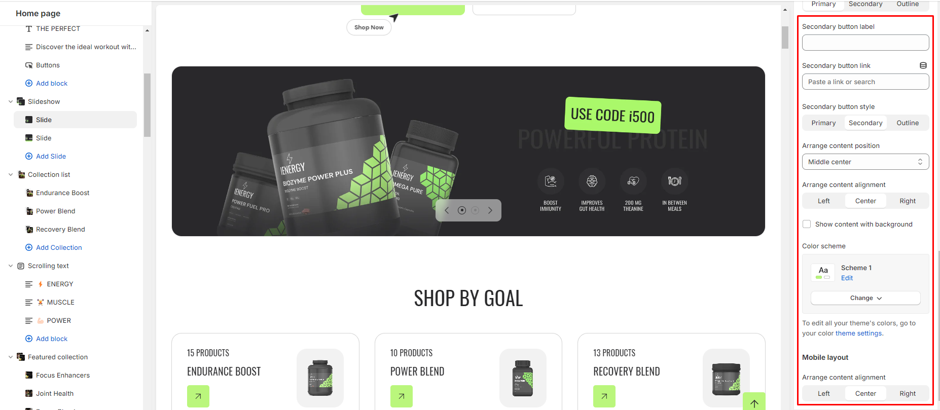
7.Configure the primary and secondary buttons and label the buttons, also provide their respective links.
8.Select the style for each button (primary, secondary, or outline).
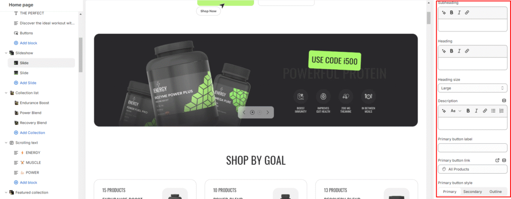
Arrange the content position and alignment within the slide.
9.Optionally, show content with a background if required.
10.Customize the color scheme from the available options if necessary.
12.Adjust the alignment of content for mobile devices.
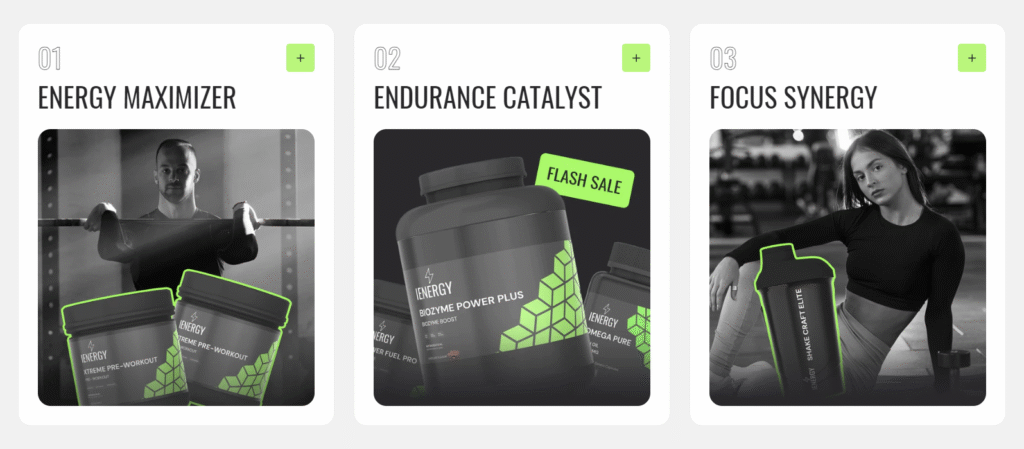
Multicolumn
What is a multicolumn section?
The Multicolumn section typically includes settings that let you customize various aspects of the layout, such as the number of columns per row, column spacing, alignment, color schemes, and more. This flexibility allows website owners and designers to create diverse layouts to suit different content needs and design preferences.
How to set up a multicolumn section?
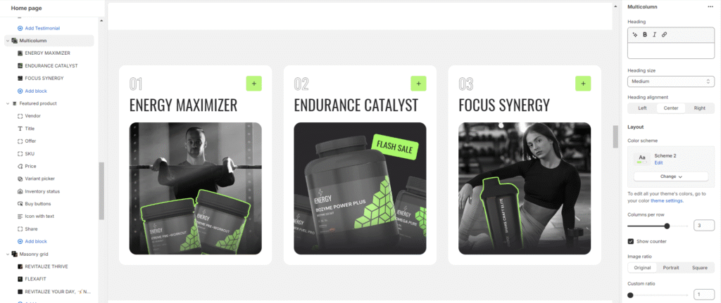
- Navigate to the template section and add the multicolumn section.
- Customize the multicolumn section using the options available on the right side.
- Set the heading for the Multicolumn section and choose the heading size.
- Specify the alignment of the heading (Left, Center, or Right).
- Choose the color scheme for the section from the available options.
- Optionally, adjust the number of columns per row you wish to display.
- Decide whether to show a counter in the section or not.
- Choose the image ratio (Original, Portrait, Square, or Custom ratio).
9.Fine-tune the spacing above and below the section using the section spacing slider.
10.Optionally, configure theme settings and apply custom CSS for unique styles according to your preference.
Add Blocks
- Choose the color scheme and the active color scheme for the column.
- Upload an image for the column if required.
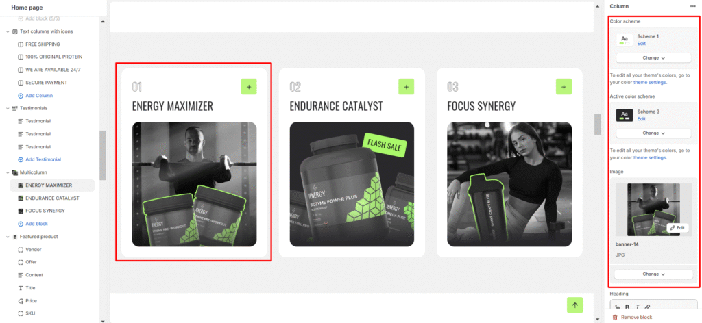
3.Set the column name heading and choose the heading size for the column.
4.Add a description for the column content.
5.Specify a button label for the column and provide a button link for the column.
6.Lastly, Choose the button style (Primary, Secondary, or Outline).
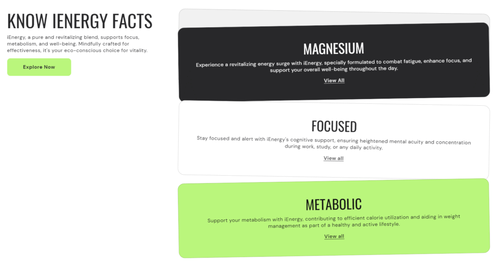
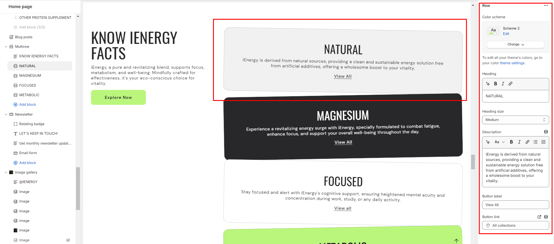
Multirow
What is a multirow section?
A Multi Row Section typically refers to a section within a web page layout where content is arranged in multiple rows, often with varying styles, formats, or purposes. This kind of section is commonly used in website design to present diverse information or features in an organized and visually appealing manner.
How to set up a multicolumn section?
Navigate to the template section and add the multirow section.
- Add a heading to the multirow section by entering your desired heading text.
- Set the heading size for the section and choose the heading alignment from the available options.
- Customize the color scheme for the section.
- Adjust the section spacing by setting values for spacing above and below the section.
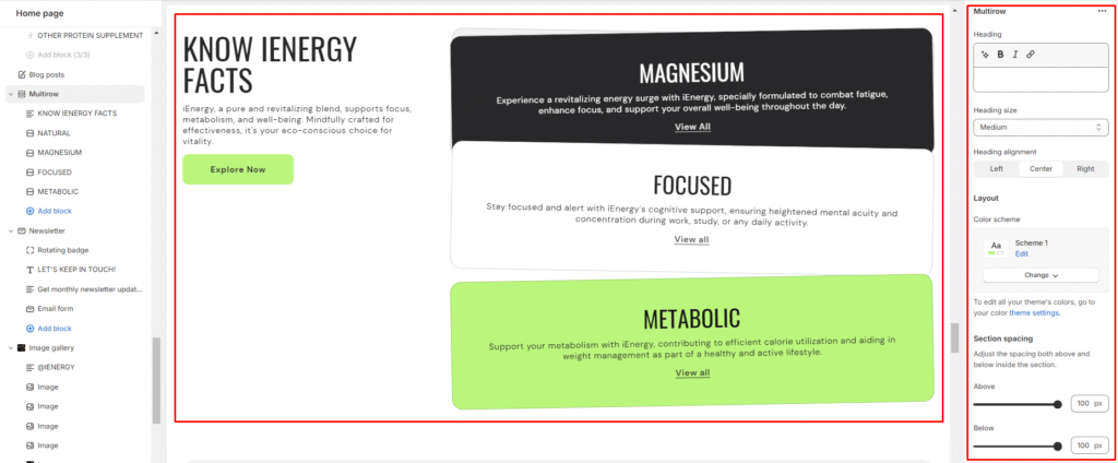
5.Optionally, add custom CSS code to further customize the appearance of the section.
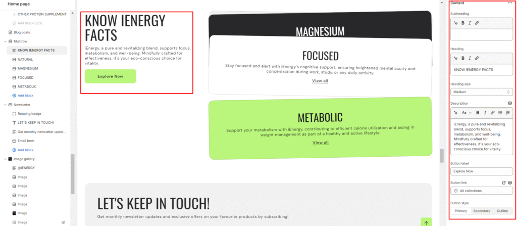
Add Blocks
- Select the content block option from the available block types.
- Add a subheading, heading to the content block and manage the heading size.
- Provide a description for the content block to inform customers about product details and highlight distinctions.
- Set the button label for the primary and secondary buttons .
- Enter the appropriate links for the primary and secondary buttons.
- Choose the button style from the options available.
7.Now add the row block to the multirow section.
8.Customize the color scheme for the row block .
9.Add a heading to the row block and manage its size.
10.Provide a description for the row block to highlight your product, collection, or blog posts and add additional information.
11.Set the button label and enter the appropriate link to it.
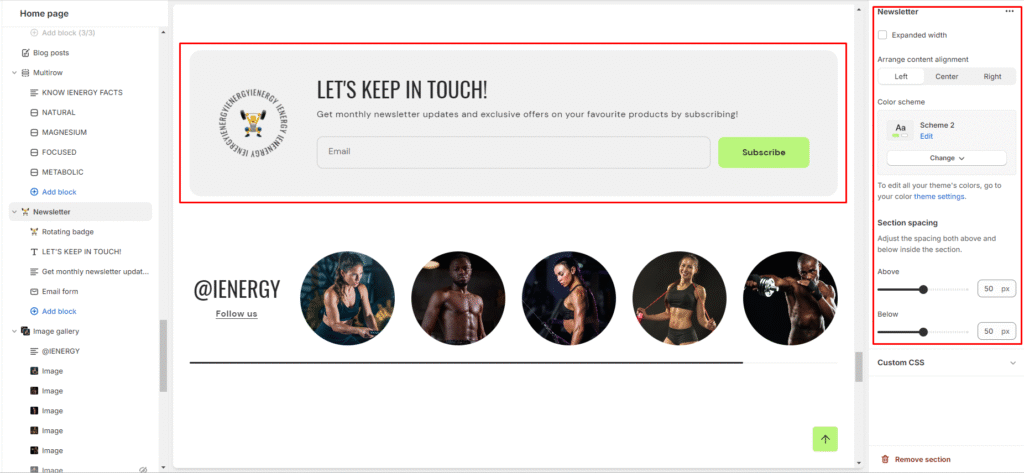
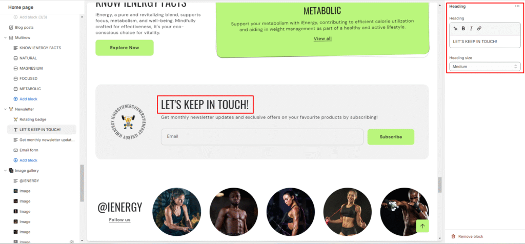
Newsletter
What is a newsletter section?
A newsletter section in a website theme refers to a designated area or component within the website layout where visitors can subscribe to receive regular updates, news, promotions, or content from the website owner or organization. This section typically includes a form where users can input their email address and sometimes other details such as their name or interests.
Newsletter sections are commonly found on the homepage or in the footer of a website, although they can also be integrated into other pages or displayed as pop-ups. The purpose of a newsletter section is to capture visitor information and build a subscriber list for marketing purposes. Once users subscribe, they may receive periodic emails with relevant information, special offers, or announcements from the website.
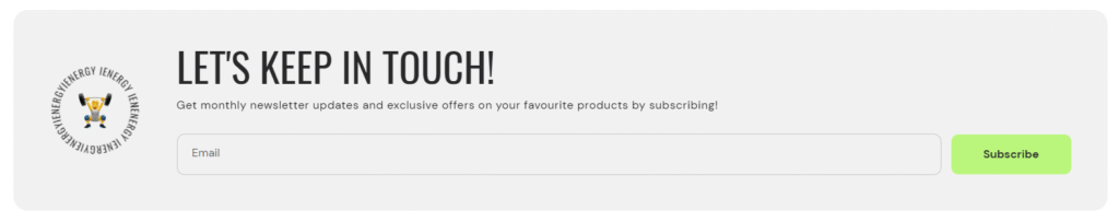
How to set up a newsletter section?
- Access the theme editor and include the newsletter section.
- Adjust the layout of the section by enabling the “expand width” option.
- Manage the content alignment by choosing from the three available options.
- Choose a color scheme for your newsletter section from the four options provided.
- Fine-tune the spacing above and below the section using the section spacing slider.
Add Blocks
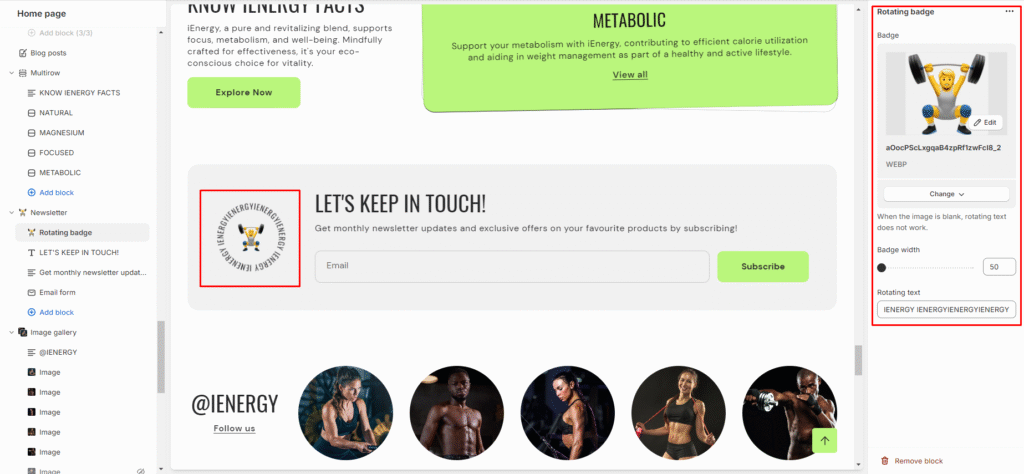
- Within the added newsletter section, add four blocks: heading, text, email form, and rotating badge. These options are available below the newsletter section where the “add block” option is located.
- Customize the heading block by clicking on it and adjusting the heading text and size in the options on the right side of the screen.
3.Similarly, add a description in the text section by clicking on it and filling in the description fields.
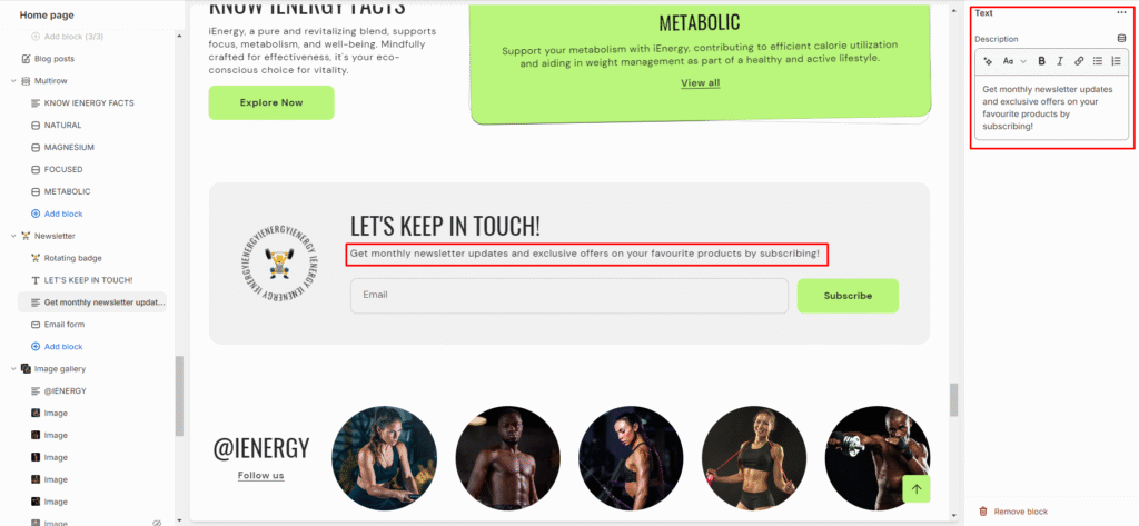
4.The email form will be visible for customers to input their email addresses.
5.For the rotating badge, upload images and set the rotating text in the designated field.
Contact form
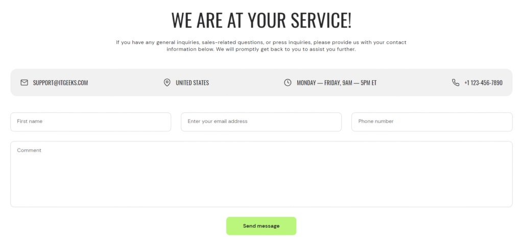
What is a contact form section?
A contact form section is a component of a website or web page that allows visitors to send messages or inquiries to the website owner or administrator. It typically includes fields for inputting the visitor’s name, email address, subject of the message, and the message itself. The contact form may also include additional fields such as phone number, company name, or address, depending on the specific needs of the website owner.
How to set up a contact form?
- Access the theme editor and include the contact form section.
- Once the contact Form section is added, you’ll find customization options on the right side.
- Add the heading for the contact form section and choose the size of the heading.
- Add a description you wish to add in your contact form.
- Choose a color scheme for your contact information from the four options provided.
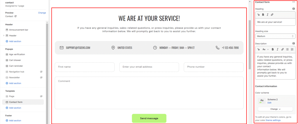
6.Provide your contact information such as email address, phone number, business address and shop opening time.
7.Fine-tune the spacing above and below the contact form section using the section spacing slider to ensure it fits seamlessly into your website layout.
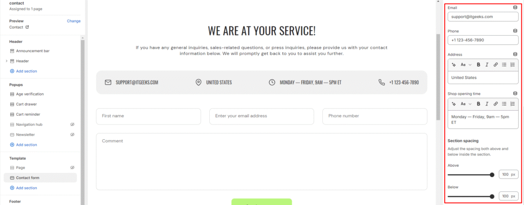
8.Optionally, configure theme settings and apply custom CSS to achieve unique styles according to your preference.
Video
What is a video section?
A video section is a specific area or segment on a webpage dedicated to displaying video content. It’s a design element commonly found in themes for creating visually engaging and interactive websites. The purpose of a video section is to attract and engage visitors by showcasing videos that can be related to various topics such as product demonstrations, tutorials, testimonials, promotional content, brand stories, and more.
How to set up a video?
- Access the theme editor and include the video section, after adding the section you will find the customization option on the right side of the screen.
- From there, add the heading for the video section and manage its size.
- Specify the alignment of the heading (Left, Center, or Right).
- Then you have the option to expand width of the section
- Choose the color scheme for the section from the available options.
- Set the video playback option and set the options (Shopify-hosted video or embed video from URL).
- If using a Shopify-hosted video, select the option and configure autoplay settings.
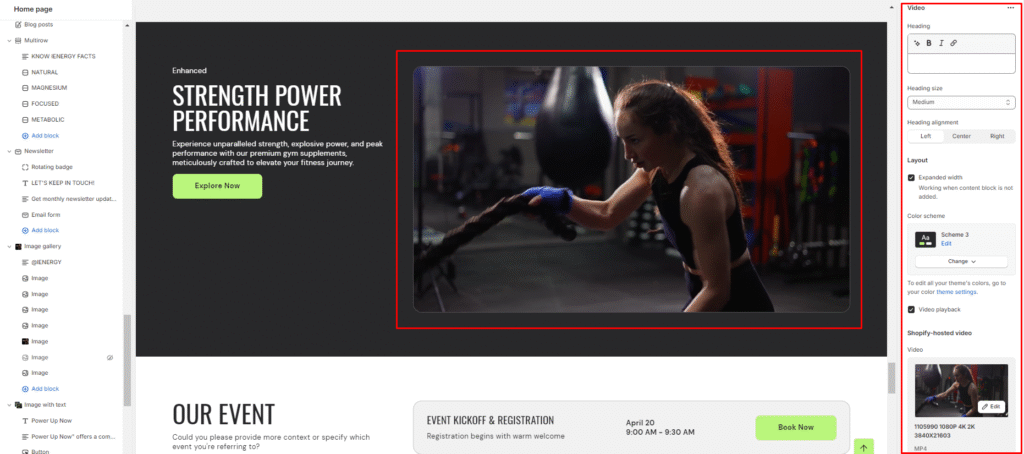
8.If embedding a video from a URL (e.g., YouTube or Vimeo), paste the video URL.
9.Add a cover image for the video section and provide video alt text for accessibility.
10.Fine-tune the spacing above and below the section using the section spacing slider.
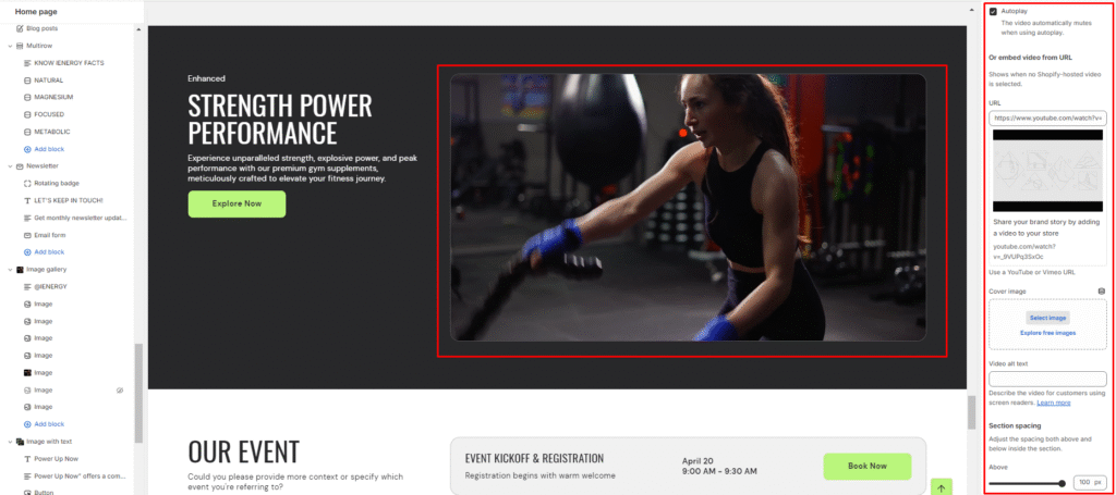
11.Optionally, configure theme settings and apply custom CSS for unique styles according to your preference.
Add Blocks
- Choose the color scheme for the content block
- Within the Video section, add a new block called content Block.
- Set a subheading, heading for the block and choose the heading size.
- Add a description for the video content.
- Provide a button label and link for viewers to access more video content.
6.Choose the button style (Primary, Secondary, or Outline).
Blog posts
What is a blog posts section?
A blog post section is a dedicated area within a website where blog posts are displayed. It typically consists of a series of individual blog posts arranged in a grid or list format, often with features such as post titles, excerpts, images, publication dates, and author names. The blog post section allows visitors to access and navigate through the latest or featured blog content easily. It is a fundamental component of websites that focus on regularly publishing articles, news, opinions, or other types of content in a blog format.
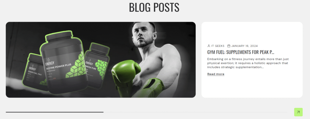
How to set up a blog posts section?
- Navigate to the template section and locate the option to add a blog post section.
- Access customization options for the blog post section, typically found on the right-hand side of the interface.
- Set the heading for the blog post section and configure the heading size.
- Choose the alignment for the heading.
- Determine the layout and color scheme for the blog post section.
- Specify the maximum number of blogs to display or enable the “View all” button if required.
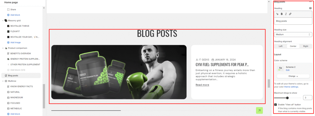
7.Customize the color scheme for the blog grid and select the blog you wish to display.
8.Adjust the image ratio for the blog posts. Options typically include Original, Portrait, Square, or Custom ratio.
9.Enable the option to position the image on the right
10.Decide whether to display the date and author of each blog post.
11.Fine-tune the spacing above and below the contact form section using the section spacing slider to ensure it fits seamlessly into your website layout.
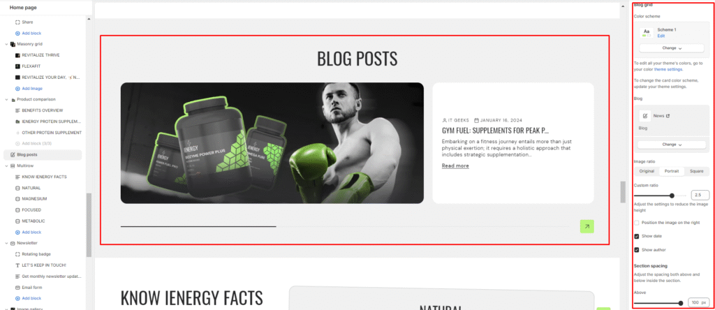
12.Optionally, configure theme settings and apply custom CSS to achieve unique styles according to your preference.
Custom Liquid
What is a custom liquid section?
A custom liquid section in the theme editor empowers experienced developers to incorporate unique and dynamic elements into Shopify stores by injecting bespoke code written in liquid. This tool provides greater creative control and personalization, allowing developers to extend the theme’s capabilities beyond built-in sections. However, caution is advised for those lacking expertise, as potential theme update issues may arise. Consider alternative approaches to avoid introducing risks or complexities.
How to set up a custom liquid section?
- Go to the theme editor and add the custom liquid section.
- After adding the custom liquid section, find the option to modify it on the right side.
- Inside the custom liquid section, utilize the field provided to insert the liquid code. Include app snippets or other code for more advanced customizations.
- Select the color scheme for your custom liquid section from the four options provided.
- Finally, fine-tune the spacing above and below the section using the section spacing slider.
- Optionally, utilize the option to add custom CSS for incorporating unique styles to the section.
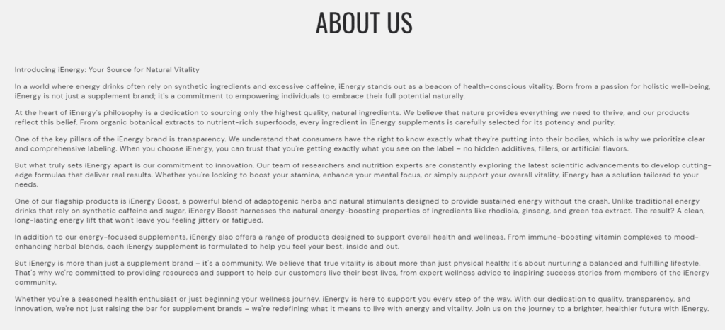
Page
What is a page section?
The page section in a website refers to a designated area where specific pages or sections of content are displayed. These pages could include the home page, about us page, contact page, services page, and any other pages that provide essential information about the website or its offerings.
How to set up a page section?
- Navigate to the template section and add the page section from the available options.
- Choose the page you wish to display from the page options available.
- Choose the desired heading size from the options provided .
- Align the heading as per your preference (e.g., Left, Center, Right).
- Choose the color scheme for the section. If needed, adjust the color scheme by accessing the color theme settings.
- Finally, fine-tune the spacing above and below the section using the section spacing slider.
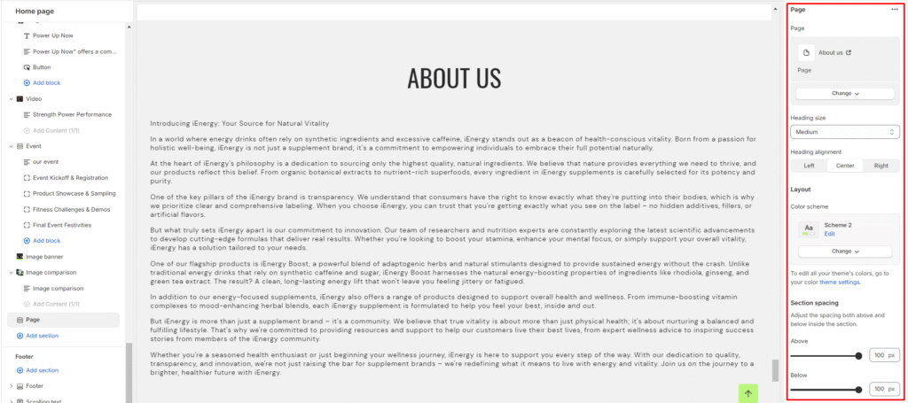
7.Optionally, utilize the option to add custom CSS for incorporating unique styles to the section.
Countdown clock
What is a countdown clock section?
A countdown clock section is a specific section within a website that displays a timer counting down to a particular event or deadline. This type of section is commonly used in various contexts, such as product launches, limited-time offers, event promotions, or any situation where there is a time-sensitive action or announcement.
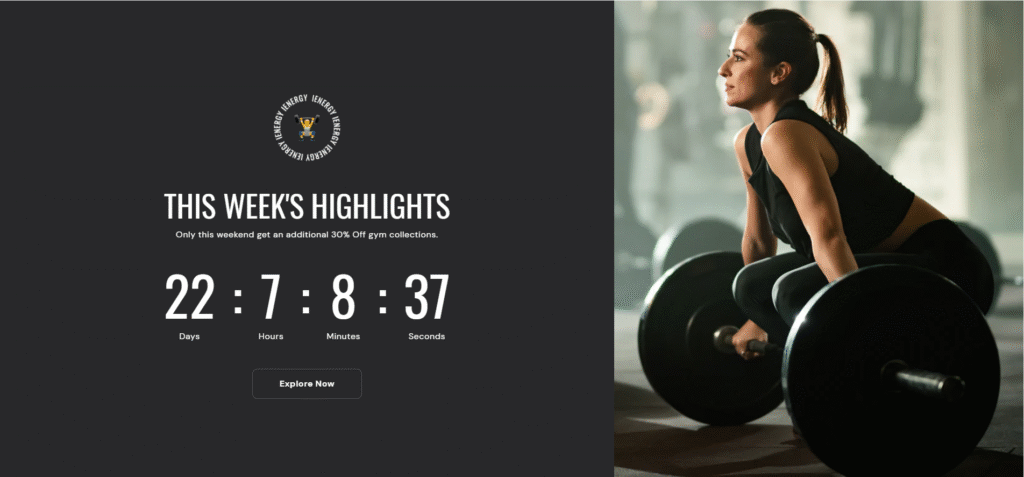
How to set up a countdown clock section?
- Navigate to the template section and add the countdown clock section, upon adding you will find the customization option on the right side.
- Enable the expand width and expand section to fullscreen options if required.
- Choose the color scheme for the section
- Finally, fine-tune the spacing above and below the section using the section spacing slider.
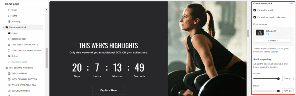
5.Optionally, utilize the option to add custom CSS for incorporating unique styles to the section.
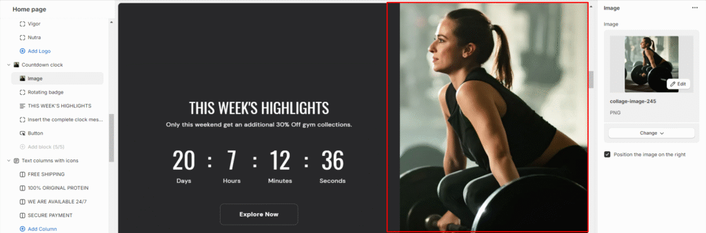
Add Blocks
- Within the countdown clock section, add an image block.
- Upload an image or select one from available sources.
- Position the image on the right side of the section from the available option.
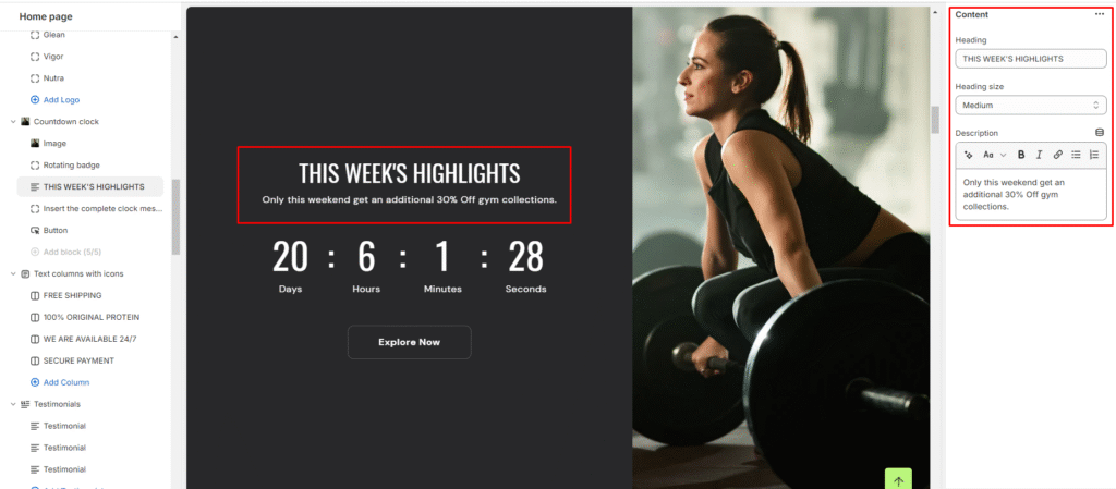
4.Now add a second content block.
5.Set the heading for the content block and choose its size.
6.Write a description for the countdown clock.
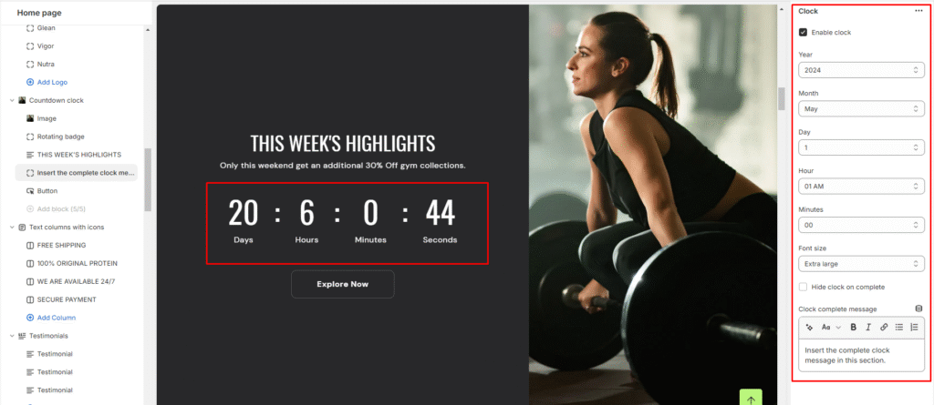
7.Add a new block called clock block and enable the countdown clock from there.
8.Set the countdown date, time, and font size.
9.Decide whether to hide the clock after completion and provide a completion message.
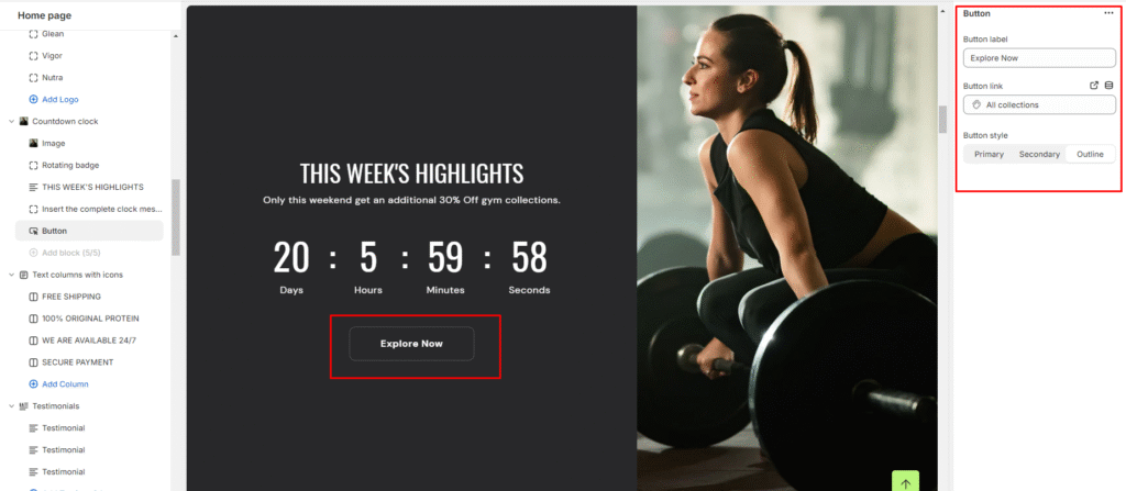
10.Lastly, add a new button block
11.Set the button label and the button link.
12.Choose the button style (Primary, Secondary, or Outline).
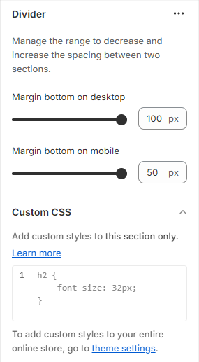
Divider
What is a divider?
A divider in the theme editor serves as a tool that allows you to control and enhance the spacing between two sections within your website. This feature plays a crucial role in optimizing the visual layout and overall aesthetic appeal of your site by providing a means to create well-defined and visually pleasing separations between different content areas. It grants you the flexibility to customize the spacing according to your design preferences, contributing to a more polished and organized appearance for a seamless user experience.
How to set up a divider?
- Navigate to the theme editor and insert a divider between the desired sections.
- On the right side, locate the option to manage the spacing range between the sections.
- Utilize the first slider to adjust the desktop margin-bottom, ranging from a minimum of -100px to a maximum of 100px.
- Use the second slider to modify the mobile margin-bottom, with a range from a minimum of -50px to a maximum of 50px.
- Optionally, utilize the option to add custom CSS for incorporating unique styles to the section.
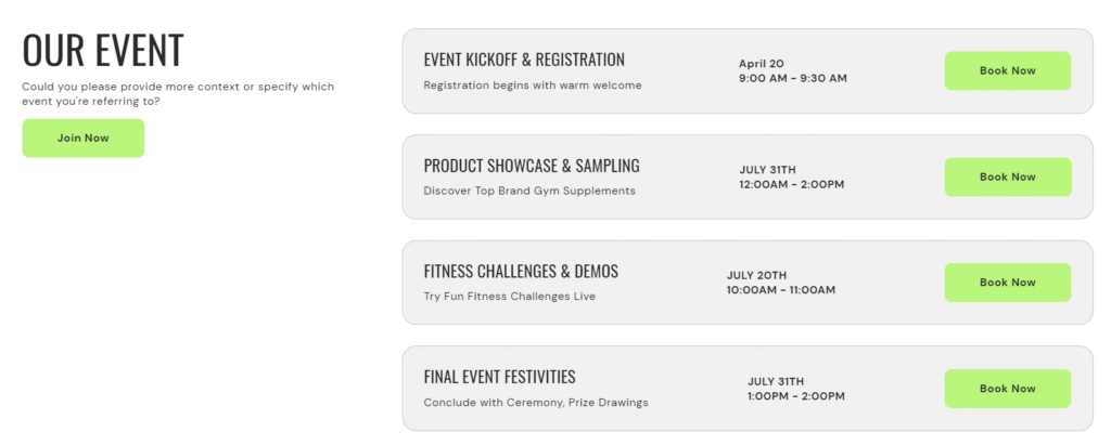
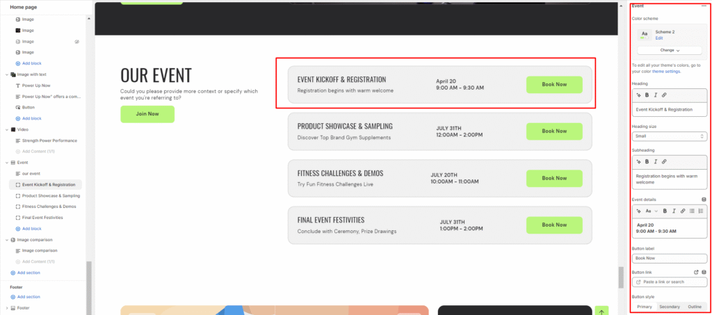
Event
What is an event section?
An event section is a dedicated part of a website that is designed to showcase upcoming events, such as conferences, workshops, webinars, product launches, and other scheduled activities. The purpose of an event section is to inform visitors about upcoming events, provide details and descriptions, and encourage participation or attendance.
How to set up an event section?
- Navigate to the template section and locate the option to add a event section.
- Access customization options for the event section, typically found on the right-hand side of the interface.
Set the heading for the event Section and manage the heading size.
- Specify the alignment of the heading (Left, Center, or Right).
- Select the color scheme for the section from the available options.
- Finally, fine-tune the spacing above and below the section using the section spacing slider.
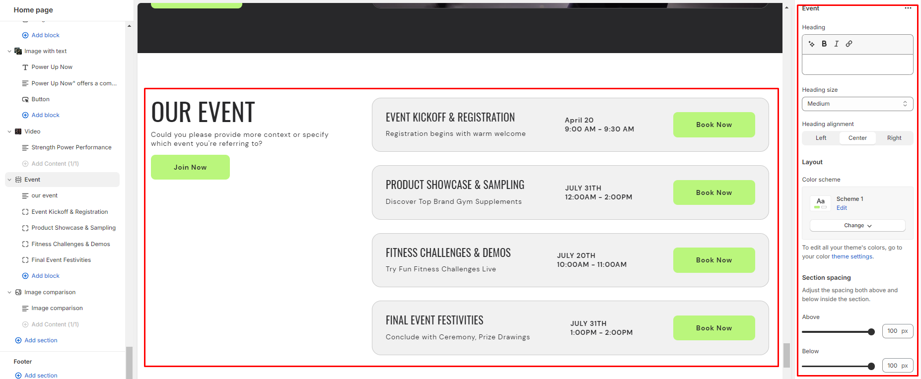
4.Optionally, utilize the option to add custom CSS for incorporating unique styles to the section.
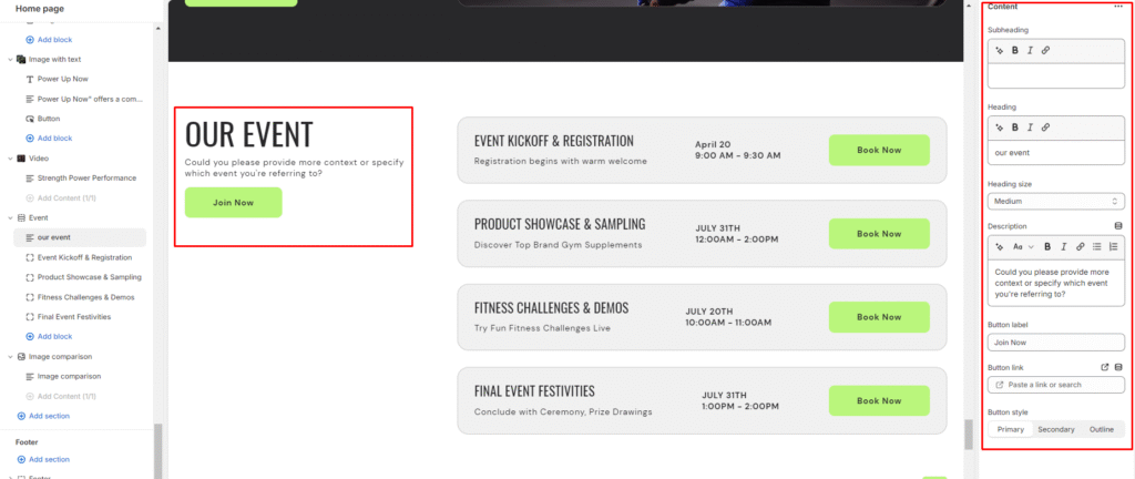
Add Blocks
- Add a content clock within the event section.
- Set a subheading, heading for the content block and choose the heading size.
- Add a description for customers to discover and engage with upcoming events.
- Specify a button label and link for users to learn more about the events.
- Choose the button style (Primary, Secondary, or Outline).
6.Similarly, add an event block within the event section.
7.Set the color scheme for the event block from the options available.
8.Set the heading for the event block and choose the heading size
9.Optionally add a subheading to share information and details about the event.
10.Provide event details such as date, time, and any additional information.
11.Specify a button label and link for users to register or learn more about the event.
12.Choose the button style (Primary, Secondary, or Outline).
FAQ's
What is a FAQ's section?
A FAQ (Frequently Asked Questions) section is a dedicated part of a website where common questions and their answers are compiled to provide users with quick and easy access to information. The purpose of a FAQ section is to address the most common inquiries that users may have regarding a product, service, or topic, thereby reducing the need for individual support inquiries and enhancing user experience.
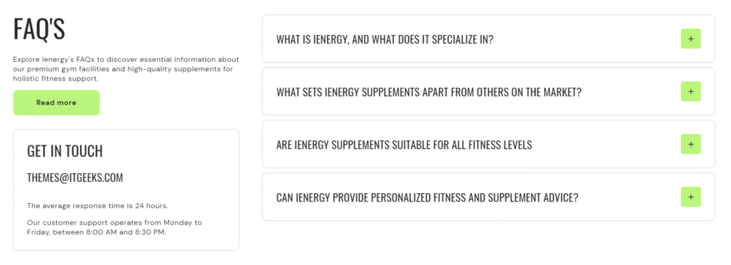
How to set up a FAQ's section?
- Navigate to the template section and add a FAQ’s section.
- Access customization options for the FAQ’s section, typically found on the right-hand side of the interface.
- Add a heading to the FAQ’s section and configure the heading size by choosing between Small, Medium, or Large.
- Align the heading to the left, center, or right as per your preference.
- Customize the color scheme for your FAQ’S section.
- Enable vertical scrolling if your FAQ blocks exceed five to allow users to scroll through the FAQs vertically.
- Finally, fine-tune the spacing above and below the section using the section spacing slider.
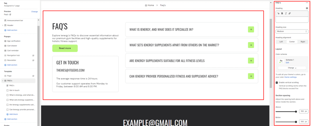
8.Optionally, utilize the option to add custom CSS for incorporating unique styles to the section.
Add Blocks
- Add a content block within the FAQ’s section.
- Include a subheading by entering your desired subheading text.
- Add a heading to the block and set its size.
- Provide a comprehensive description of your frequently asked questions (FAQs) to address common queries.
- Add button labels and links for primary and secondary buttons.
- Choose the button style (Primary, Secondary, or Outline).
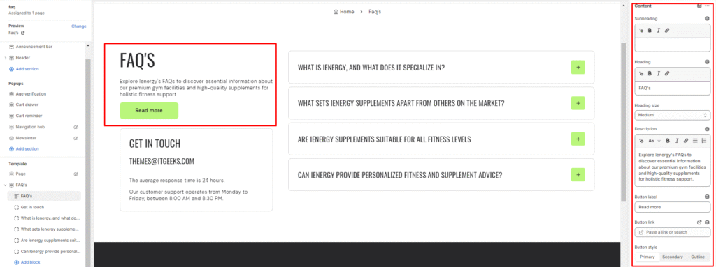
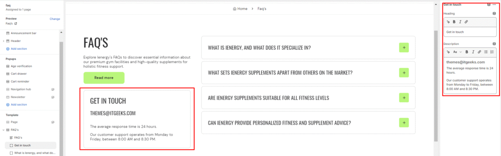
7.Similarly, add a Get in touch block within the FAQ’s section.
8.Enter the heading text, such as “Get in touch.”
9.Include a description or instructions for users to get in touch with you.
10.Lastly, add a Faq block within the FAQ’s section.
11.Enter the heading text for the Faq block.
12.Provide a description or instructions related to the FAQs.
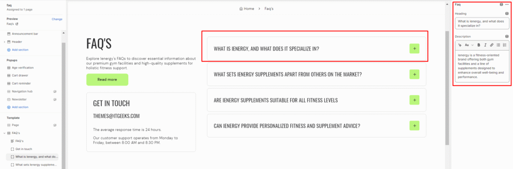
Image comparison
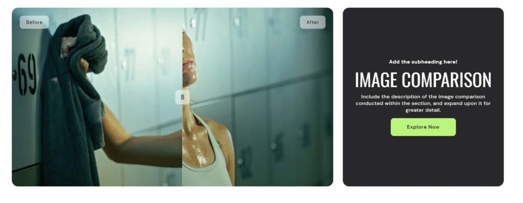
What is an image comparison section?
An Image Comparison Section is a design element commonly used in websites to showcase visual differences between two images. It allows visitors to interactively compare and contrast the before and after versions of an image, making it an effective tool for showcasing transformations, improvements, or changes over time.
How to set up an image comparison section?
- Navigate to the template section and add the image comparison section.
- Access customization options for the image comparison section, typically found on the right-hand side of the interface.
- Set the heading for the image comparison section and choose the heading size for it.
- Specify the alignment of the heading (Left, Center, or Right).
- Select the color scheme for the section from the options available.
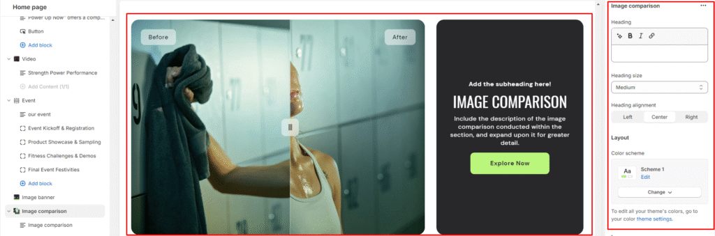
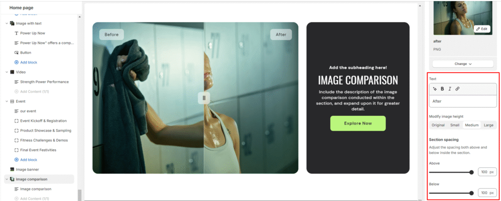
6.Upload “Before” and “After” images for the comparison.
7.Add descriptive text for the “Before” and “After” images.
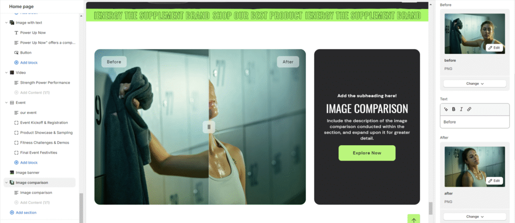
8.Optionally modify the image height (Original, Small, Medium, Large).
9.Finally, fine-tune the spacing above and below the section using the section spacing slider.
10.Optionally, utilize the option to add custom CSS for incorporating unique styles to the section.
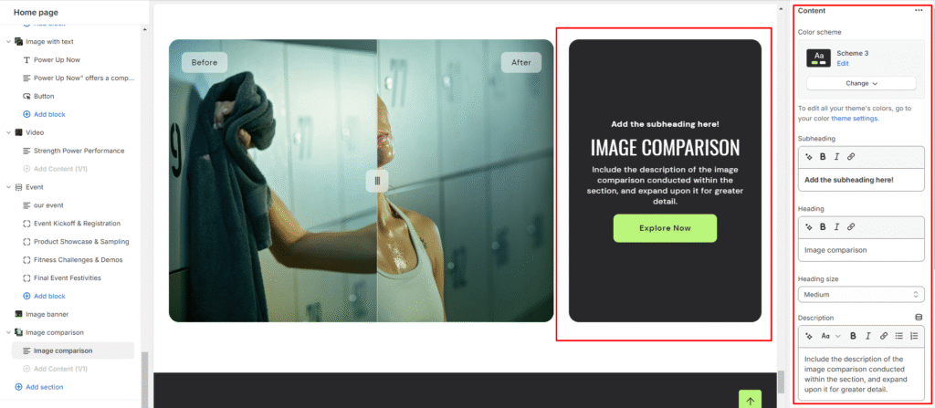
Add Blocks
- Set the color scheme for the block from the options available.
- Add a content block within the image comparison section.
- Set a subheading, heading for the block and set the heading size.
- Add a description of the image comparison, providing detailed information.
5.Specify a button label and link for users to explore more or take action.
6.Choose the button style (Primary, Secondary, or Outline).
7.Optionally, arrange the content position (Top, Middle, Bottom) and alignment (Left, Center, Right) within the block.
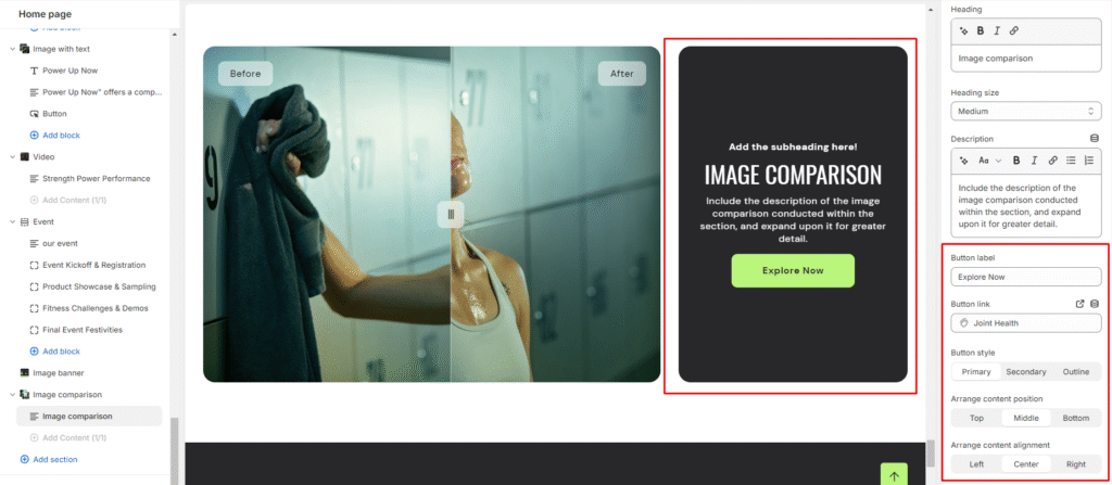
Image Gallery
What is an image gallery section?
An image gallery section in the theme editor is a customizable feature that enables users to display a collection of images in a visually appealing and organized manner on their website. This section allows you to showcase multiple images in a grid or carousel format, providing a user-friendly way to present visual content such as product photos, portfolio images, or any other visual elements relevant to your website’s purpose. Users can typically upload, arrange, and customize the appearance of images within the gallery section to enhance the overall aesthetic and engagement of their website
How to set up an image gallery section?
- Go to the theme editor and add the image gallery section.
- After integrating the image gallery section, customize its settings by accessing the options on the right side.
- Start by adding a heading to the section. Tailor the heading size and alignment according to your preferences from the provided options.
- Directly below, manage the layout of the image gallery section. Choose a color scheme from the four available options.
- Specify the range for displaying the columns per row. Opt to enable the slider scrollbar for a visual presentation of images in a scrollbar, or, if disabled, the images will be visible in a second row based on the selected columns per row.

6.Opt for the image ratio from three available options: Original, Portrait, and Square. Additionally, enable the circular style for images and activate hover effects as desired.
7.Choose the number of columns per row you wish to display for the mobile layout.
8.Fine-tune the spacing above and below the section using the section spacing slider.
9.Lastly, access Theme Settings to enable the Sequential Sections on the Scroll option.
10.Optionally, utilize the option to add custom CSS for incorporating unique styles to the section.
Add Blocks
- Once the image gallery section is added, you can choose to include both image and text blocks within that section.
- After adding the image and text block, you’ll find options to customize each block.
- By clicking on the text block, customization options will appear on the right side.
- Choose the heading you want for the image gallery and select its size from the available options: Small, Medium, Large, Extra Large.
- Describe your image gallery in the provided fields, and enhance customer experience by adding a button label and linking it.
6.Similarly, you can customize your image block on the right side.
7.Here, you can add the image and insert its corresponding link.
Logo list
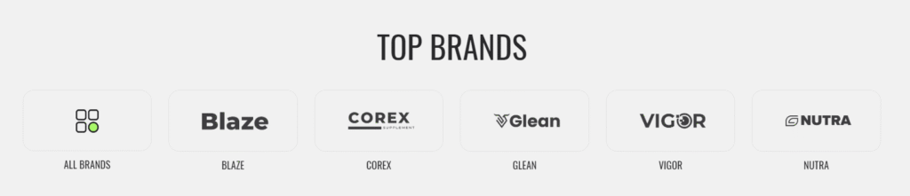
What is a logo list section?
A “Logo List Section” is a design element commonly used on websites to showcase logos of companies, partners, clients, or affiliations in a visually appealing and organized manner. It is a way to highlight the brands or entities associated with the website owner or to showcase collaborations and endorsements.
How to set up a logo list section?
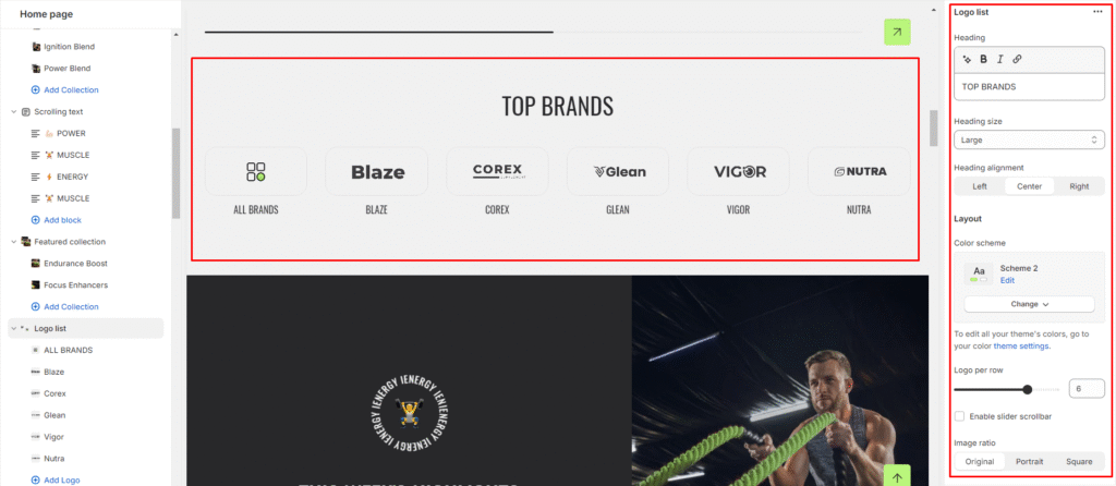
- Go to the theme editor and add the logo list section.
- After integrating the logo list section, customize its settings by accessing the options on the right side.
- Set the heading for the logo list section and choose the heading size.
- Specify the alignment of the heading (Left, Center, or Right).
- Select the color scheme for the section from the available options.
- Set the number of logos per row you wish to display.
- Enable the slider scrollbar for navigation if desired.
- Choose the image ratio (Original, Portrait, Square).
9.Set the title size and specify the content alignment (Left, Center, or Right).
10.Configure the mobile layout settings for the logo list section logos per row and slider scrollbar).
11.Finally, fine-tune the spacing above and below the section using the section spacing slider.
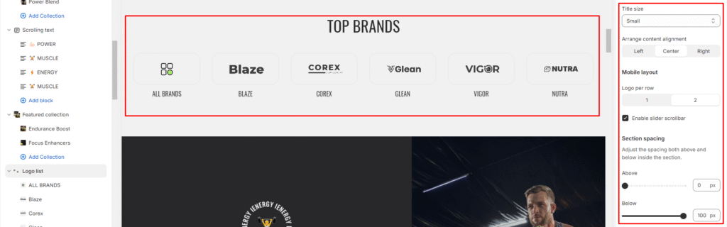
12.Optionally, utilize the option to add custom CSS for incorporating unique styles to the section.
Add Blocks
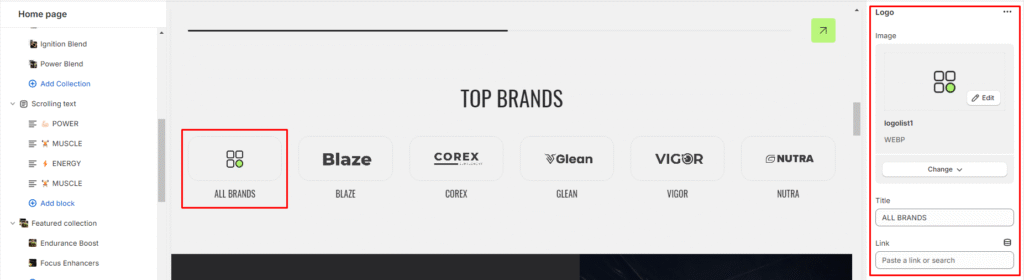
- Add a logo block within the logo list section.
- Upload the logo image or select from available images.
- Set the title for the logo and add the link associated with the logo.
Map
What is a map section?
The map section typically includes features such as the ability to zoom in and out, navigate using street view, and sometimes includes additional information like directions, nearby points of interest, or contact details related to the location displayed on the map. Setting up a map section on a website involves embedding the map using a map API (Application Programming Interface) such as Google Maps API or OpenStreetMap API. This usually requires obtaining an API key and customizing the map’s appearance, functionality, and information displayed to suit the website’s needs.
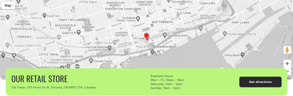
How to set up a map section?
- Go to the theme editor and add the map section.
- After integrating the map section, customize its settings by accessing the options on the right side.
- Add a heading to introduce the map section and choose the heading size from the available options.
- Select the alignment for the heading (Left, Center, Right).
- Choose a color scheme for the map section from the available 4 options.
- Upload an image related to the map section if needed and choose the image ratio (Original, Small, Medium, Large).
7.Obtain and enter your Google Maps API key to display the map accurately.
8.Decide whether to enable a grayscale filter for the map.
9.Select a color scheme for the map.
10.Add the name of the location associated with the map and choose the font size for the location name.
11.Input the address for the map to pinpoint the exact location using Google Maps.
12.Specify the operating hours for the location and add a button label for a call-to-action button related to the map section.
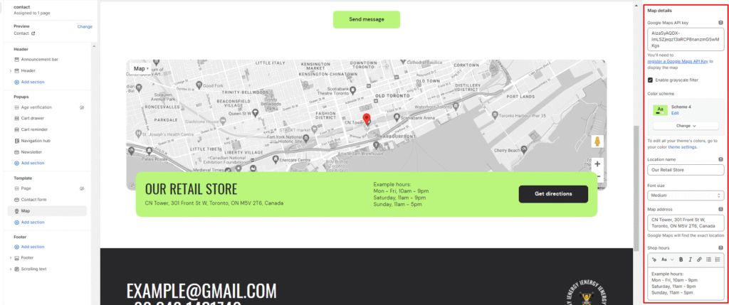
13.Finally, fine-tune the spacing above and below the section using the section spacing slider.
14.Optionally, utilize the option to add custom CSS for incorporating unique styles to the section.
Masonry grid
What is a masonry grid section?
A masonry grid section is a layout design to display content in a dynamic and visually appealing way. Unlike traditional grid layouts where all items have the same height and are aligned in rows and columns, a masonry grid allows items to have varying heights and aligns them based on available vertical space. This results in a more flexible and organic layout that can accommodate content of different sizes and aspect ratios without leaving excessive white space.
How to set a masonry grid section?
- Go to the theme editor and add the masonry grid section.
- After integrating the masonry grid section, customize its settings by accessing the options on the right side.
- Add a heading to the masonry grid section and set the heading for it.
- Align the heading to the left, center, or right as per your preference.
- Customize the color scheme from the available options.
- Finally, fine-tune the spacing above and below the section using the section spacing slider.
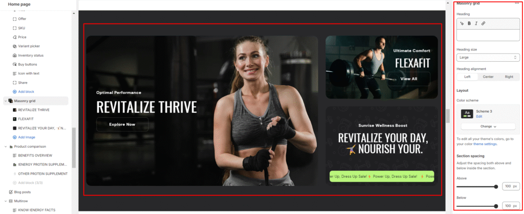
7.Optionally, utilize the option to add custom CSS for incorporating unique styles to the section
Add Blocks
- Add an image block within the masonry grid section.
- Choose the color scheme for the image block.
- Upload images by selecting images from your device or exploring free images.
- Adjust the desktop image height to your preferred size.
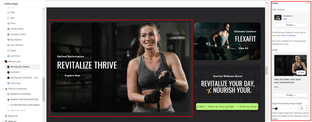
5.Add a subheading, heading and manage the heading size.
Provide a detailed description of your product or collection in the description field.
6.Set button labels and links for buttons.
7.Choose the button style (Primary, Secondary, or Outline).
8.Arrange content alignment to the left, center, or right.
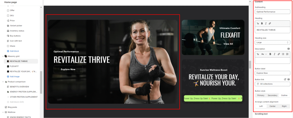
9.Optionally, enable scrolling text, choose a color scheme for the scrolling text and add the text in it.
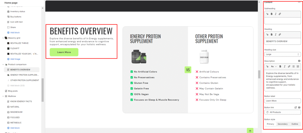
Product comparison
What is a product comparison section?
A product comparison section is a feature commonly found on e-commerce websites or product-focused platforms. Its primary purpose is to allow users to compare multiple products side by side, helping them make informed purchasing decisions based on detailed comparisons of features, specifications, pricing, and other relevant criteria.
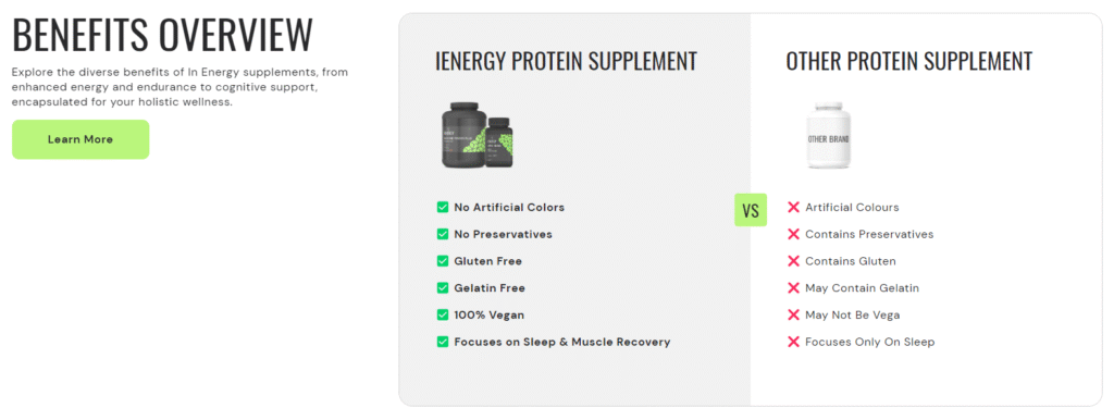
How to set up a product comparison section?
- Navigate to the theme editor and add the product comparison section.
- Customize the settings of the product comparison section by accessing the options located on the right side after its addition.
- Add a heading to the section by entering your desired heading text.
- Set the heading size and align it to the left, center, or right based on your preference.
- Choose the color scheme for the section from the available option.
- Finally, fine-tune the spacing above and below the section using the section spacing slider.
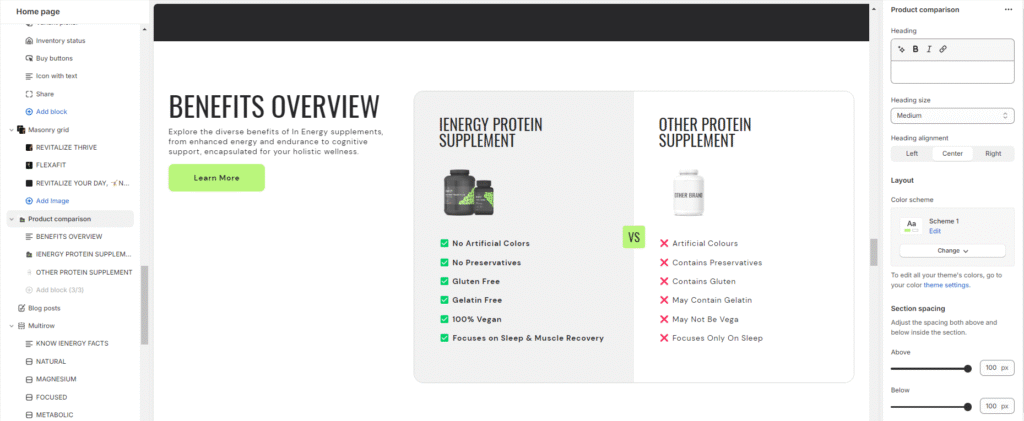
7.Optionally, utilize the option to add custom CSS for incorporating unique styles to the section.
Add Blocks
- Within the product comparison section, add the content block
- Add a subheading to the content block by entering your desired subheading text.
- Add a heading to the block and set the heading size.
- Provide a description in the description field to explain the purpose of the product comparison and showcase differences between products.
- Set button labels and links for the buttons.
- Choose the button style (Primary, Secondary, or Outline).
Now add the product block and choose the color scheme for it .
7.Upload product images or select from free images to represent the products in the comparison.
8.Add a heading to the product block and set the heading size.
9.Provide a description of each product’s features or benefits in the description field using checkboxes or bullet points.
Progress ticker
What is a progress ticker section?
A progress ticker section is a graphical element used on websites to visually represent progress or completion status. It typically consists of a horizontal or vertical bar, line, or ticker that fills up or moves across the screen to indicate progress toward a specific goal, milestone, or completion of a task. Progress tickers are commonly used in various contexts, such as fundraising campaigns, project management tools, online surveys, learning platforms, and more.
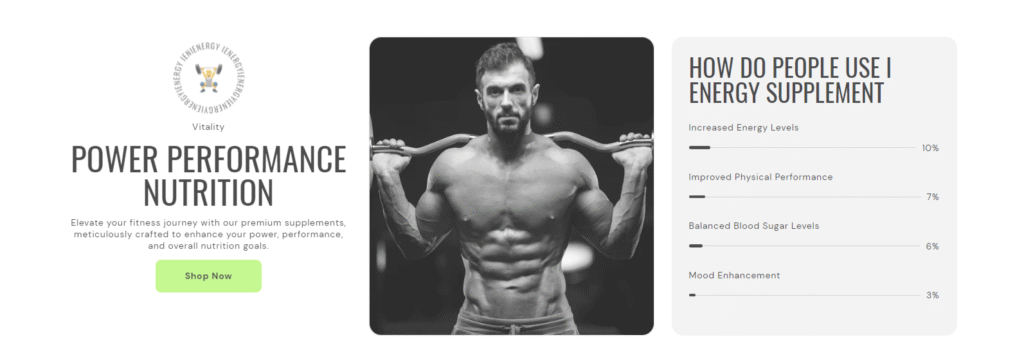
How to set up a progress ticker section?
- Navigate to the theme editor and add the progress ticker section.
- Customize the settings of the progress ticker section by accessing the options located on the right side after its addition.
- Add a heading to the Progress ticker section by entering your desired heading text.
- Set the heading size to and align it to the left, center, or right based on your preference.
- Choose the color scheme for the section.
- Finally, fine-tune the spacing above and below the section using the section spacing slider.
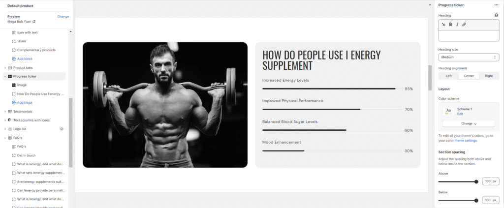
7.Optionally, utilize the option to add custom CSS for incorporating unique styles to the section.
Add Blocks
- Within the progress ticker section, add the progress block.
- Choose the color scheme for the progress block.
- Add a heading for the progress ticker, and adjust the heading size.
- Include a description in the description field to explain the purpose or significance of the progress ticker.
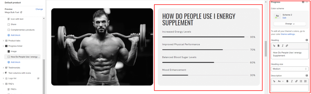
5.Enter progress information by adding headings and specifying the progress percentage for each item.
6.Now, you can add the content block within the progress ticker section.
7.Upload a badge image or select from free images to represent the content block.
8.Set the badge width, and if applicable, enable rotating text within the badge.
9.Add a subheading and heading to the content block. Also, manage the heading size.
10.Provide a description of the progress ticker in the description field.
11.Set button labels and links for the buttons.
12.Choose the button style (Primary, Secondary, or Outline) and arrange content alignment as desired.
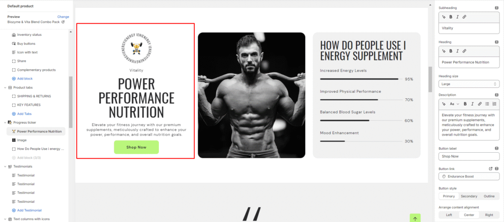
13.Select the image block option and upload an image in the section
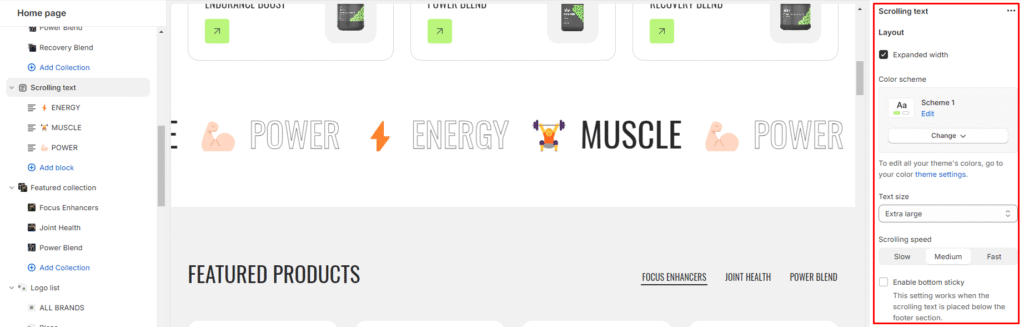
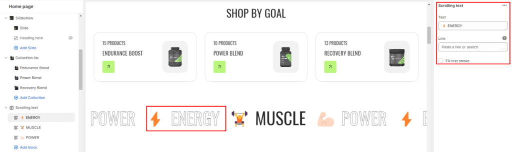
Scrolling Text
What is a scrolling text section?
A scrolling text section in the theme editor is a customizable component that allows users to display text that moves horizontally across a specified area on their website. This dynamic feature is often used to highlight important messages, announcements, or promotional content in a visually engaging manner. Users can typically control the speed, space, and styling of the scrolling text, providing a dynamic and attention-grabbing element to enhance the overall design and interactivity of their website. This section is handy for conveying information in a space-efficient way, especially when dealing with limited-screen real estate.

How to set up a scrolling text section?
- Navigate to the theme editor and add the scrolling text section.
- Customize the settings of the image scrolling text section by accessing the options located on the right side after its addition.
- You can manage the layout of the section by enabling the expand width option.
- Choose a color scheme from the four available options and adjust the text size using the size option provided.
- Next, you can adjust the scrolling speed to be Slow, Medium, or Fast.
- Enable the bottom sticky option. This setting is effective when the scrolling text is positioned below the footer section.
- Fine-tune the spacing above and below the section using the section spacing slider.
- You also have the option to add social links for platforms such as Facebook, Instagram, YouTube, TikTok, Twitter, Pinterest, Snapchat, Tumblr, and Vimeo.
- Optionally, you can utilize the custom CSS option to incorporate unique styles into the section.
Add Blocks
- After successfully adding the scrolling text section, you have the option to include both the scrolling text and scrolling social links block within this section.
- Upon adding the scrolling text block, you’ll discover customization options available on the right side.
- Enter the desired text and link in the provided field, which users can access by clicking on the text.
- Additionally, you can activate the “Fill text stroke” feature to modify the style of the scrolling text.
- Likewise, for scrolling social links, you need to link your social media accounts in the theme settings.
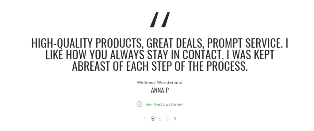
Testimonials
What is a testimonials section?
A testimonials section is a dedicated part of a website that showcases feedback, reviews, and testimonials from customers, clients, or users. Its primary purpose is to provide social proof and build credibility by highlighting positive experiences and opinions about a product, service, or brand.
How to set up a testimonials section?
- Navigate to the theme editor and add the testimonials section.
- Customize the settings of the testimonials section by accessing the options located on the right side after its addition.
- Choose a color scheme for your contact information from the four options provided.
- Fine-tune the spacing above and below the contact form section using the section spacing slider to ensure it fits seamlessly into your website layout
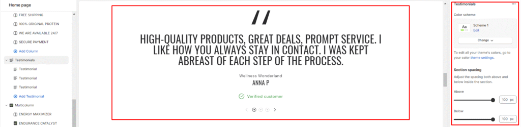
5.Optionally, configure theme settings and apply custom CSS to achieve unique styles according to your preference.
Add Blocks
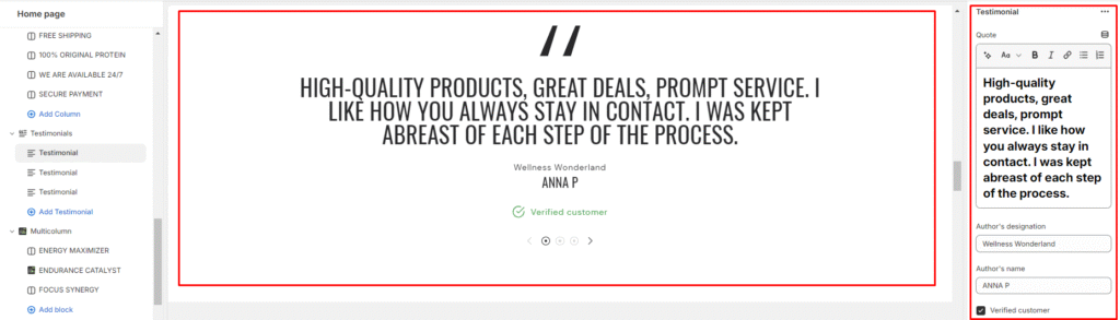
- After setting up the testimonial section, set up the block section within it.
- In the testimonial block, enter the quote from your customer that you want to showcase.
- Specify the author’s designation or title. This could be their job title, position, or role related to the testimonial.
- Enter the name of the author who provided the testimonial.
- If the testimonial is from a verified customer, add a label such as “Verified Customer” or “Verified Purchase” to indicate authenticity.
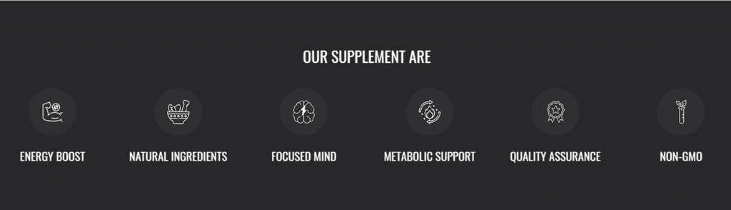
Text columns with icons
What is a text columns with icons section?
A text columns with icons section is a design element to present information in a structured and visually appealing format. It typically consists of multiple columns of text content alongside corresponding icons or symbols that visually represent the content or topic being discussed. This section is often used to highlight key features, services, benefits, or points of interest in a concise and organized manner.
How to set up text columns with icons section?
- Navigate to the theme editor and add the text columns with icons section.
- Customize the settings of the text columns with icons section by accessing the options located on the right side after its addition.
- Add a heading to the section by entering your desired heading text.
- Set the heading size and align it to the left, center, or right based on your preference.
- Choose the color scheme for the section and customize the column style as either Simple or Classic, depending on your design preference.
- Specify the number of columns per row and set the title size.
Arrange the content alignment within the columns to the left, center, or right.
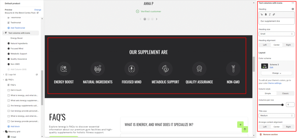
7.Define the mobile layout settings, including the number of columns per row for mobile devices (1 or 2 columns per row).
8.Finally, fine-tune the spacing above and below the section using the section spacing slider.
9.Optionally, utilize the option to add custom CSS for incorporating unique styles to the section.
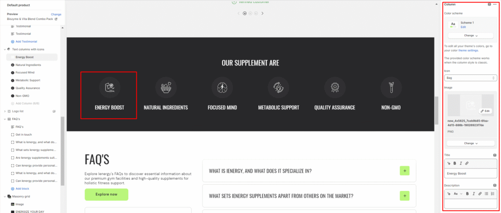
Add Blocks
- Within the text columns with icons section, add the column block.
- Choose the color scheme for the column block.
- Select an icon or upload an image to represent the column content. You can choose an icon like a bag or upload a custom image.
- Add a title for the column to describe the icon or image.
- Include a description in the description field to explain the significance and function of the icon or image within the column.
Footer
Custom Liquid
What is a custom liquid section?
A custom liquid section in the theme editor empowers experienced developers to incorporate unique and dynamic elements into Shopify stores by injecting bespoke code written in liquid. This tool provides greater creative control and personalization, allowing developers to extend the theme’s capabilities beyond built-in sections. However, caution is advised for those lacking expertise, as potential theme update issues may arise. Consider alternative approaches to avoid introducing risks or complexities.
How do you set up a custom liquid section?
- Go to the theme editor and add the custom liquid section.
- After adding the custom liquid section, find the option to modify it on the right side.
- Inside the custom liquid section, utilize the field provided to insert the liquid code. Include app snippets or other code for more advanced customizations.
- Select the color scheme for your custom liquid section from the four options provided.
- Finally, fine-tune the spacing above and below the section using the section spacing slider.
- Optionally, utilize the option to add custom CSS for incorporating unique styles to the section.
Divider
What is a divider?
A divider in the theme editor serves as a tool that allows you to control and enhance the spacing between two sections within your website. This feature plays a crucial role in optimizing the visual layout and overall aesthetic appeal of your site by providing a means to create well-defined and visually pleasing separations between different content areas. It grants you the flexibility to customize the spacing according to your design preferences, contributing to a more polished and organized appearance for a seamless user experience.
How to set up a divider?
- Navigate to the theme editor and insert a divider between the desired sections.
- On the right side, locate the option to manage the spacing range between the sections.
- Utilize the first slider to adjust the desktop margin-bottom, ranging from a minimum of -100px to a maximum of 100px.
- Use the second slider to modify the mobile margin-bottom, with a range from a minimum of -50px to a maximum of 50px.
- Optionally, utilize the option to add custom CSS for incorporating unique styles to the section.
Image Gallery
What is an image gallery section?
An image gallery section in the theme editor is a customizable feature that enables users to display a collection of images in a visually appealing and organized manner on their website. This section allows you to showcase multiple images in a grid or carousel format, providing a user-friendly way to present visual content such as product photos, portfolio images, or any other visual elements relevant to your website’s purpose. Users can typically upload, arrange, and customize the appearance of images within the gallery section to enhance the overall aesthetic and engagement of their website.
How to set up an image gallery section?
- Go to the theme editor and add the image gallery section.
- After integrating the image gallery section, customize its settings by accessing the options on the right side.
- Start by adding a heading to the section. Tailor the heading size and alignment according to your preferences from the provided options.
- Directly below, manage the layout of the image gallery section. Choose a color scheme from the four available options.
- Specify the range for displaying the columns per row. Opt to enable the slider scrollbar for a visual presentation of images in a scrollbar, or, if disabled, the images will be visible in a second row based on the selected columns per row.
6.Opt for the image ratio from three available options: Original, Portrait, and Square. Additionally, enable the circular style for images and activate hover effects as desired.
7.Choose the number of columns per row you wish to display for the mobile layout.
8.Fine-tune the spacing above and below the section using the section spacing slider.
9.Lastly, access Theme Settings to enable the Sequential Sections on the Scroll option.
10.Optionally, utilize the option to add custom CSS for incorporating unique styles to the section.
Add Blocks
- Once the image gallery section is added, you can choose to include both image and text blocks within that section.
- After adding the image and text block, you’ll find options to customize each block.
- By clicking on the text block, customization options will appear on the right side.
- Choose the heading you want for the image gallery and select its size from the available options: Small, Medium, Large, Extra Large.
- Describe your image gallery in the provided fields, and enhance customer experience by adding a button label and linking it.
6.Similarly, you can customize your image block on the right side.
7.Here, you can add the image and insert its corresponding link.
Newsletter
What is a newsletter section?
A newsletter section in a website theme refers to a designated area or component within the website layout where visitors can subscribe to receive regular updates, news, promotions, or content from the website owner or organization. This section typically includes a form where users can input their email address and sometimes other details such as their name or interests.
Newsletter sections are commonly found on the homepage or in the footer of a website, although they can also be integrated into other pages or displayed as pop-ups. The purpose of a newsletter section is to capture visitor information and build a subscriber list for marketing purposes. Once users subscribe, they may receive periodic emails with relevant information, special offers, or announcements from the website.
How to set up a newsletter section?
- Access the theme editor and include the newsletter section.
- Adjust the layout of the section by enabling the “expand width” option.
- Manage the content alignment by choosing from the three available options.
- Choose a color scheme for your newsletter section from the four options provided.
- Fine-tune the spacing above and below the section using the section spacing slider.
Add Blocks
- Within the added newsletter section, add four blocks: heading, text, email form, and rotating badge. These options are available below the newsletter section where the “add block” option is located.
- Customize the heading block by clicking on it and adjusting the heading text and size in the options on the right side of the screen.
3.Similarly, add a description in the text section by clicking on it and filling in the description fields.
4.The email form will be visible for customers to input their email addresses.
5.For the rotating badge, upload images and set the rotating text in the designated field
Scrolling Text
What is a scrolling text section?
A scrolling text section in the theme editor is a customizable component that allows users to display text that moves horizontally across a specified area on their website. This dynamic feature is often used to highlight important messages, announcements, or promotional content in a visually engaging manner. Users can typically control the speed, space, and styling of the scrolling text, providing a dynamic and attention-grabbing element to enhance the overall design and interactivity of their website. This section is handy for conveying information in a space-efficient way, especially when dealing with limited-screen real estate.
How do you set up a scrolling text section?
- Navigate to the theme editor and add the scrolling text section.
- Customize the settings of the image scrolling text section by accessing the options located on the right side after its addition.
- You can manage the layout of the section by enabling the expand width option.
- Choose a color scheme from the four available options and adjust the text size using the size option provided.
- Next, you can adjust the scrolling speed to be Slow, Medium, or Fast.
- Enable the bottom sticky option. This setting is effective when the scrolling text is positioned below the footer section.
7.Fine-tune the spacing above and below the section using the section spacing slider.
8.You also have the option to add social links for platforms such as Facebook, Instagram, YouTube, TikTok, Twitter, Pinterest, Snapchat, Tumblr, and Vimeo.
9.Optionally, you can utilize the custom CSS option to incorporate unique styles into the section.
Add Blocks
- After successfully adding the scrolling text section, you have the option to include both the scrolling text and scrolling social links block within this section.
- Upon adding the scrolling text block, you’ll discover customization options available on the right side.
- Enter the desired text and link in the provided field, which users can access by clicking on the text.
- Additionally, you can activate the “Fill text stroke” feature to modify the style of the scrolling text.
- Likewise, for the scrolling social links, you need to link your social media accounts in the theme settings.
Footer
What is the footer section?
A footer section in a theme refers to the bottom part of a webpage or document layout. It typically contains information that is consistent across multiple pages, such as copyright notices, contact information, links to important pages (like a privacy policy or terms of service), social media icons, and sometimes a brief site map or navigation menu. The footer is important for providing users with essential information and navigation options, especially when they reach the end of a page or website. It helps in enhancing user experience and providing a cohesive design throughout the entire website.
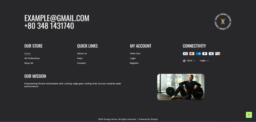
How to set up the footer section?
- Start by navigating to the footer section within the home page settings. You’ll find customization options located on the right side of the screen.
- Choose the color scheme for your footer from the four available options.
- After setting the color scheme, add the contact information which you wish to display in your footer section.
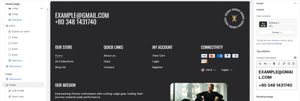
4.To set up the rotating badge, first, upload images and input rotating text in the designated field. Additionally, you can customize the badge width using the slider.
5.Keep in mind that if the image field is left blank, the rotating text won’t be displayed.
6.Include any additional text in the field you want to display.
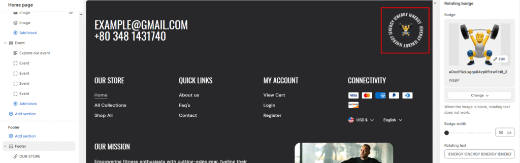
6.Enable the “Show powered by Shopify” link option and policy links. To add store policies, navigate to your policy settings.
7.Next, you can choose to enable the “Follow on Shop” option. Note that for customers to follow your store on the Shop app from your storefront, Shop Pay must be enabled.
8.Adjacent to that option is the ability to manage the mobile layout by enabling accordion blocks.
9.Finally, fine-tune the spacing above and below the section using the section spacing slider.
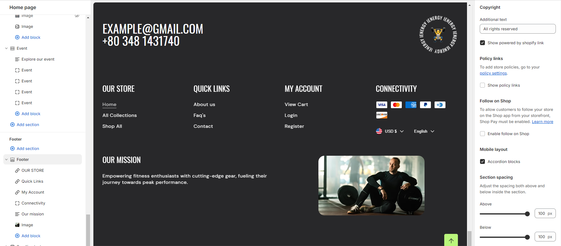
Add Blocks
- In the footer section, you have four blocks available: Menu, Connectivity, Text, and Image. These can be added according to your needs.
- To add any of these blocks, click on “Add Block” below the footer, where you’ll find these four options.
- When adding the Menu block, customization options will appear on the right side of the screen.
- Input the heading and select the menu you wish to display from the options provided.
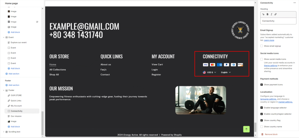
5.Similarly, for the connectivity block, customization options are available on the right side.
6.Begin by adding a heading to the block.
7.Options to enable Email Signup, Social Media Icons, and Show Social Media Icons will appear under the heading.
8.Localization options include enabling the language selector, country/region selector, displaying the country flag, and showing the country name.
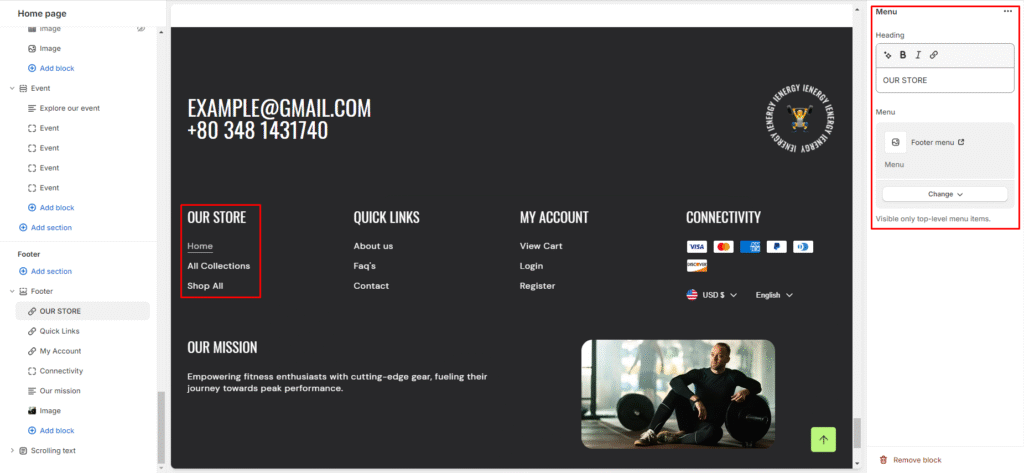
9.The Text block allows you to add a heading and description.
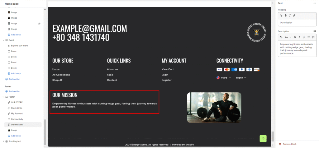
10.Finally, the Image block lets you add an image, manage its width, and adjust its alignment.
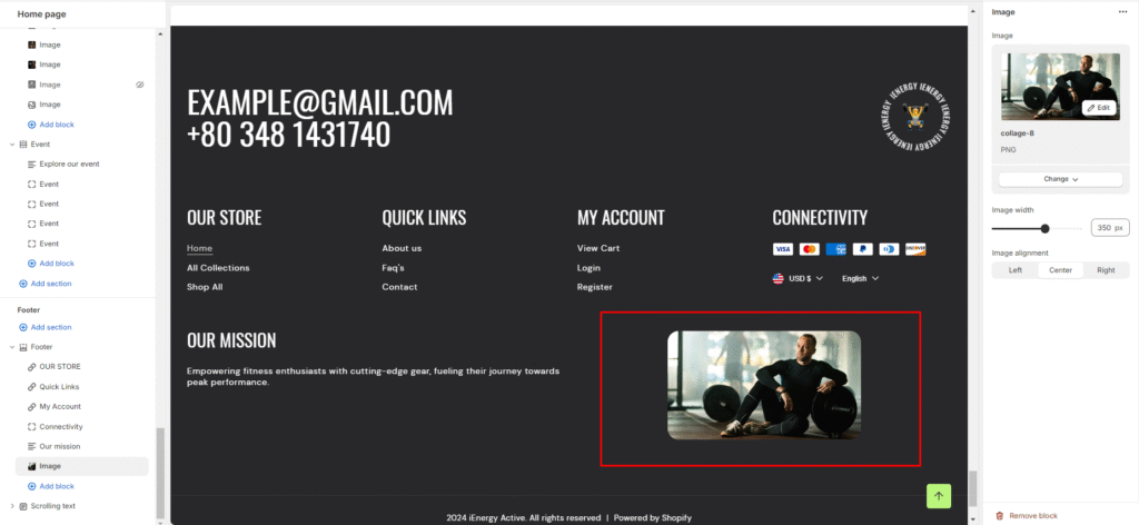
Theme Settings
General
Here are the steps for configuring the General settings within the theme settings:
- Favicon image: This setting allows you to upload a custom favicon image for your website. Click on the “Upload images” button to select an image from your computer or explore free images. The favicon image will be scaled down to 32 x 32 pixels.
- Container width: Adjust the container width for your website.
- Enable theme radius: Turn on this option if you want to apply rounded corners or a specific theme radius to elements within your website.
- Show custom cursor: Enable this setting to use a custom cursor on your website, which can enhance the user experience.
- Animations: Configure animations for elements on your website, such as fade-ins or slide effects, to add visual appeal.
- Sequential sections on scroll: If enabled, this feature allows sections of your website to appear sequentially as the user scrolls down the page.
7.Scroll to top: Enable the “Scroll to top button” to provide users with a smooth scrolling experience back to the top of the page.
8.Show only home page: If selected, certain settings or elements may only apply to the homepage of your website.
9.Currency codes: Choose whether to display currency codes alongside prices in your cart and checkout pages, for example, displaying “$1.00 USD” for clarity.
Loader
Here are the steps for configuring the Loader settings within the theme settings:
This setting allows you to customize the loading animation or screen that appears while your website is loading.
- Color scheme: Select the desired color scheme for the loader.
- Enable: Toggle this option to enable or disable the loader on your website.
- Show only home page: If selected, the loader may only be displayed on the homepage of your website.
- Logo image: Customize the logo image that appears during the loading process.
- Logo image width: Set the width of the logo image.
- Heading: Customize the text that appears along with the logo during the loading process.
- Heading size: Choose the size of the heading text.
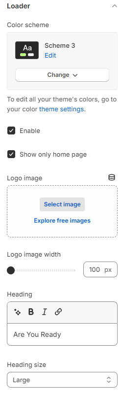
Colors
Here are the steps for configuring the Color Settings within the theme settings:
- Color Schemes: This section allows you to choose predefined color schemes that can be applied to different sections of your online store.
Scheme 1: Click on this option to apply the first predefined color scheme to your website.
Scheme 2: Select this option to apply the second predefined color scheme.
Scheme 3: Choose this option to apply the third predefined color scheme.
Scheme 4: Click on this option to apply the fourth predefined color scheme.
2.Add Scheme: If you want to create a custom color scheme, click on this button to add a new scheme and customize the colors.
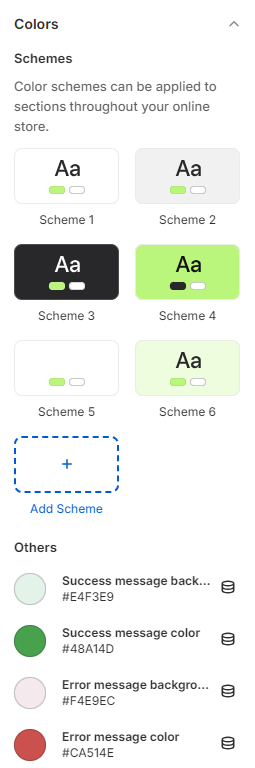
Fonts
Here are the steps for configuring the Font Settings within the theme settings:
This section allows you to customize the fonts used for headings and body text on your website.
- Headings: Configure the font settings specifically for headings.
- Base Size: Set the base font size for headings.
- Font Size Scale: Choose the font size scale for headings. Options might include small, medium, large, etc.
- Heading Font Case: Select the font case for headings, such as normal or uppercase.
5.Body: Customize the font settings for body text.
6.Font: Choose the font for body text.
7.Base Size: Set the base font size for body text.
Product badges
Here are the steps for configuring the Product Badges settings within the theme settings:
- Sale Badge Color Scheme: Select the color scheme for the sale badge. This badge typically indicates products that are currently on sale.
- Rotating Showcase: Optionally, you can display a custom sales message in addition to the sale badge. This message might be used to create urgency for limited-time offers or clearance sales.
- Sold Out Badge Color Scheme: Choose the color scheme for the sold-out badge. The sold-out badge is used to indicate products that are no longer available for purchase.
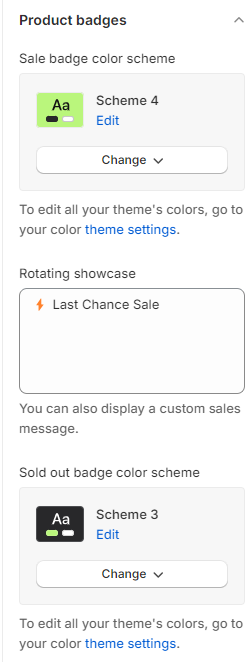
4.Custom Badge: If desired, you can display a custom badge based on specific product tags. For example, tagging a product with ‘badge_Bestseller’ would display a custom badge labeled as “Bestseller.” This feature allows you to create custom badges for various product categories or promotions.
5.Custom Badge Color Scheme: Select the color scheme for custom badges. Customize the colors to match your branding or create visually distinct badges for different purposes.
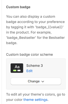
Here are the steps for configuring the Social Media Settings within the theme settings:
- Social Accounts: This section allows you to add and configure links to your various social media accounts.
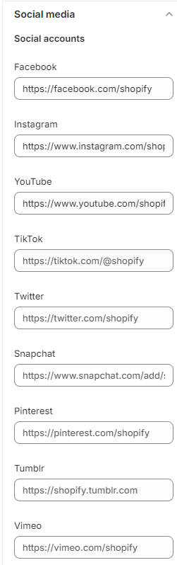
Facebook: Enter the URL for your Facebook page.
Instagram: Add the URL for your Instagram profile.
YouTube: Provide the URL to your YouTube channel.
TikTok: Enter the URL for your TikTok account.
Twitter: Add the URL to your Twitter profile.
Snapchat: Provide the URL or username for your Snapchat account.
Pinterest: Enter the URL for your Pinterest profile.
Tumblr: Add the URL for your Tumblr blog.
Vimeo: If applicable, enter the URL for your Vimeo channel or videos.
Search
Here are the steps for implementing the search section in your theme:
- Enable Search Suggestions: Ensure that the search functionality is enabled within your theme settings or configuration.
- Heading: Include a heading for the search suggestions section to indicate its purpose or title, such as “Search Suggestions” or “Recommended Searches”.
- Menu Integration: Integrate relevant menus into the search section, such as the main menu or additional navigation options.
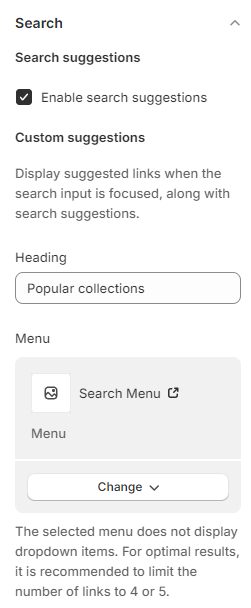
Cart
Here are the steps for implementing the cart section in your theme:
- Free Shipping Message: Enable the option to display a free shipping message within the cart section and set the minimum order amount for free shipping to $500 or any other specified amount.
- Show Cart Note: Provide an option to display a note or message in the cart section.This note could include important information or instructions for customers, such as special promotions, delivery details, or return policies.
- Terms and Conditions: Enable a checkbox for users to agree to the terms and conditions before proceeding to checkout.Include the content of the terms and conditions, which may cover aspects like shipping policies, return guidelines, and payment terms.
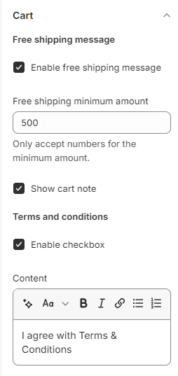
Checkout
Here are the steps for implementing the cart section in your theme: Here are the steps for implementing the checkout section in your theme:
- Banner: Add a banner to the checkout section.
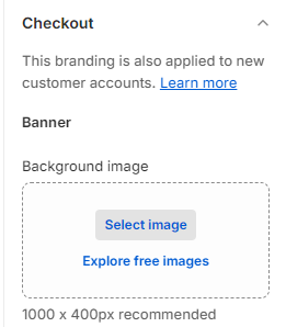
2.Logo: Allow customization of the logo displayed in the checkout section.
3.Provide options to position the logo (left, center, right) and set its size (small, medium, large).
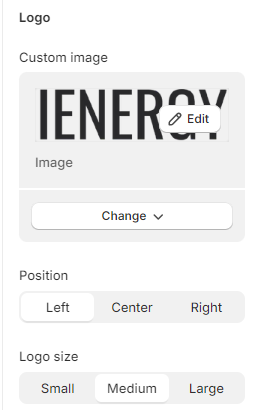
4.Main Content Area: Customize the background of the main content area in the checkout section.
5.Order Summary: Customize the background of the order summary section.
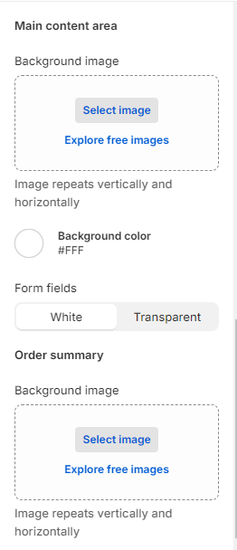
6.Typography: Customize the typography settings for headings and body text in the checkout section.
7.Colors: Define color settings for various elements in the checkout section.
8.Checkout Layout: Choose between a one-page checkout or three page layout.
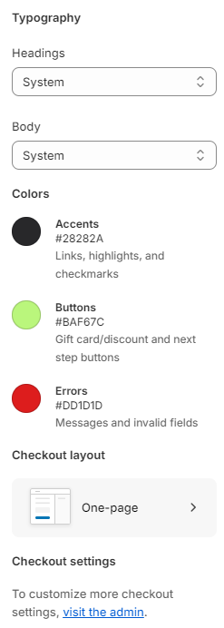
Custom CSS
Optionally, utilize the option to add custom CSS for incorporating unique styles to the section.
Social media